
“What is it about maps that intrigues us? Why do we pore over them endlessly? The answer can be found in an earlier era, before much of the earth was explored. Maps lessened the fear of the unknown and looked authoritative, even though there were blank spaces filled with animals, compasses, or cartouches, and some of the supposedly known areas were incorrectly drawn.”
Nigel Holmes: Pictorial Maps – History, design, ideas, sources
Maps are the most usual form of data visualization in children’s nonfiction picture books. It’s not rare to find maps in fiction picture books, too. Illustrated maps are the first category I have come up with in my Fulbright project.
The maps in picture books are good. Often beautiful. They are simple, easy to read and fathom, well annotated. Usually they are focused on telling one thing or a storyline, and it is clearly presented. A lot of the maps are world maps. Let me show you a few examples.

I like how Sandra Fay has painted the texts, too, in this map on endsheets. (I chose to start with a fiction picture book!)

The map on Ducks Overboard! tells about the real-life spill of tens of thousands of plastic ducks into the Pacific Ocean in January 1992 and how those ducks floated away from the spill site following ocean currents.

This map doesn’t have place names or other text linked directly to the map, but it’s function is in telling something else: It is used to show climate change destroying the habitats of animals and plants in a big scale. It does require some knowledge of the world map from the reader, but like I mentioned above… kids have most likely seen world maps before.

There’s undeniable clarity in this map-in-the-ceiling: “Too cold / hot”! It is welcome when the content is not that common knowledge.
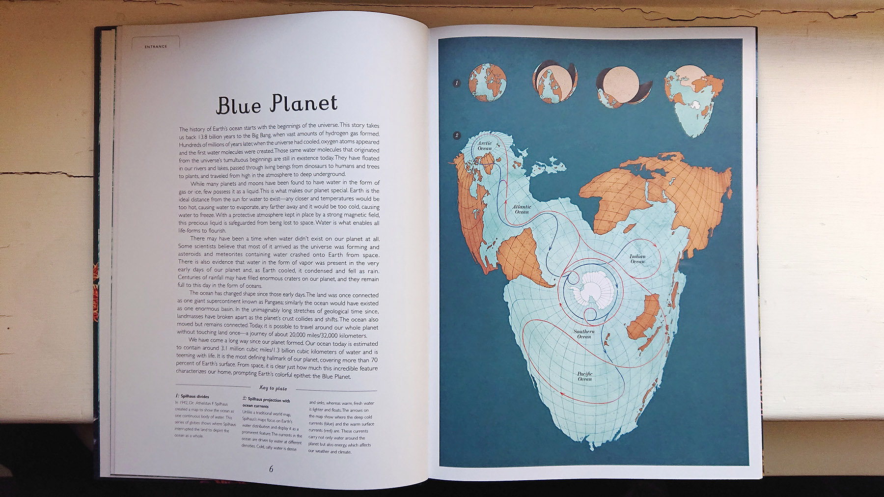
There is barely text on the Oceanarium ‘peeled orange’ map; only names of the five oceans. Such a strong and unusual map doesn’t need words, and it’s positioned at the start of the book. Like it’s saying: Start here but come back as often as you want!
Data visualization is easy to approach through maps
When looking at maps from visual/verbal narrative point of view, maps are almost always primarily visual and the verbal part is selective and sparse. We all know this: we don’t want map information explained to us. The place names are usually adequate.
During my Fulbright project I’ve talked a lot about maps. They are easy to approach; and data visualization is easy to approach through maps. I like the distinction Nigel Holmes makes in his book between atlases and pictorial maps: “Users of an atlas bring their own agenda to the reading process. The atlas is read with a mission; something needs to be found out from the basic factual well of information.”
Pictorial or illustrated maps don’t need to be approached with a mission or an agenda. “It (pictorial map) concentrates the readers’ attention on some part of itself, announcing its subject clearly – and pictorially. It is therefore different from the atlas map in that it has a specific message.”
I think this distinction can be spotted elsewhere in data visualization, too, especially when looking at things from the perspective of illustration.
Looking at structures
Can a map be the main structural factor of a book? Yes, it can.
Maps by Aleksandra Mizielińska and Daniel Mizieliński, 2013, shows a map on its every spread, altogether 52: one of the world, seven of them maps of continents and the rest are maps of countries. The chosen countries of each continent are arranged starting from the north and moving southbound. In the end of the book you can find a collection of flags.
Prisoners of Geography: Our World Explained in 12 Simple Maps by Tim Marshall, Grace Easton & Jessica Smith (Illustrators), 2019, is a book built around 12 maps. This is a book that’s not underestimating anyone: I love it that they made a book for kids from Marshall’s original book of 10 maps.
Illustrated maps are the first category I have come up with in my Fulbright project during spring 2022 exploring presentations of data in children’s nonfiction picture books published in the United States (and originated; with a few exceptions), especially in the years 2021-22. For more information on the project and on the books I have explored read here.
Interested in more?

Leave a comment