
I have been thrilled to learn the terms ‘text-image interaction’ and ‘visual and verbal interaction’ during my Fulbright project – and get acquainted with the talk of them. For some time I had been searching for the best words to talk about this theme: I feel it combines picture books and data visualization big time.
In the book ”How Picturebooks Work” (Garland Publishing 2001) Maria Nikolajeva and Carole Scott walk us through different ways of categorizing text-picture interaction first by referring to other scholarly works and then revealing their own ‘word/image table’. One of the discussed concepts is from Joanne Golden, which Nikolajeva & Scott see as an excellent starting point for a spectrum even wider.
All these concepts in the book focus in the way words and pictures collaborate in telling stories. Since I’m interested in the way words and pictures collaborate in communicating data, I thought as an experiment I would apply Golden’s five categories to illustrating data / information work work I’ve done. If it works out, I will continue to the wider spectrum by Nikolajeva & Scott. Let’s see what happens!
1. The text and pictures are symmetrical
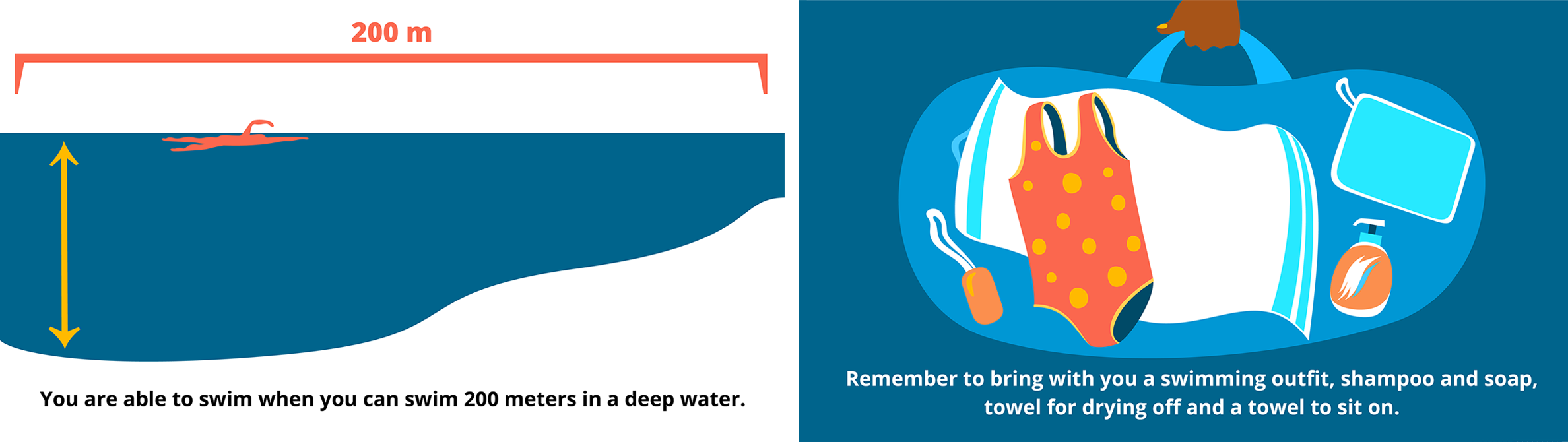
These are scenes from an animation for the Finnish Swimming Teaching and Lifesaving Federation. The intended audience was immigrant families. The text tells exactly the same that you can see in the illustration: the illustration shows exactly what’s told with words.
2. The text depends on pictures for clarification

I thought of these as entities that would not be understood without the picture. First one is an exploded view of a heart rate monitor that was made for the Runner magazine. The technical vocabulary is rather difficult and it would not be an easy read for non-experts without the illustration: illustration makes it comprehensible.
Pie chart is one of the simplest ways to present data such as in the second illustration: Three answer options to the question (from an article series by the Finnish Sports Confederation on sports and ethics) and how much each was voted for by a jury.
3. Illustration enhances, elaborates text

This category still shows collaboration of text and picture, where both carry the weight of communication. The difference with the previous category is that here the visual enhancement is not as crucial. The text alone is comprehensible.
The first illustration is a scene from an animation on low-carbon construction for the Ministry of Environment. The illustration enhances the stages referred to and the cyclicity of the life cycle (which is more visible in the animation with parts rotating back from the final to the first phase).
The second illustration is from my own project, Year 2020 illustrated. It was a story of 8 illustrations with text summarizing that year and its numbers.
4. The text carries primary narrative, illustration is selective

I think this category can point to a rather traditional, decorative role of illustration, or it can mean zooming into a specific important detail.
These illustrations were made for a presentation of NodeHealth project’s conclusions. Both illustration was built around three sentences, so text was definitely primary. The illustrations zoom in on the related professionals discussed – and they decorate.
5. The illustration carries primary narrative, text is selective

These pieces would not exist if it weren’t for the illustration: it’s the whole point. And the text follows its lead.
First illustration was made for a driving school text book. It was a pair to a bar chart of car accident causes. The writer wanted an illustration to emphasize that most accidents are caused by failures in estimation and observation, not in failures in operating the car or other reasons.
The map illustration was made for a magazine about the different definitions of the Arctic and the operators involved – Arctic Council member countries and European Union. This was the first time I actually sat down and stared at the globe from this point of view.
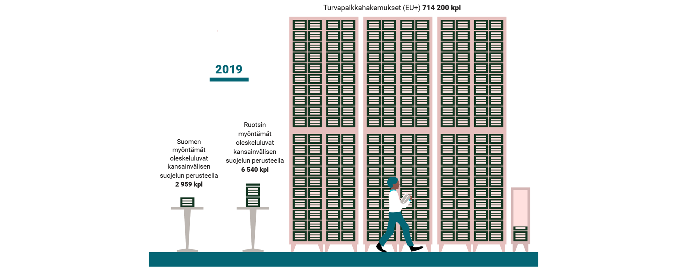
This data visualization was made for a publication on guidance of refugees. It shows the amounts of residence permits (on the basis of international protection) in Finland (2959) and Sweden (6540) in comparison to the amount of asylum applications in the European Union in 2019.
Translations in the illustrations were made by me.
List of clients: the Finnish Swimming Teaching and Lifesaving Federation, the Finnish Runner magazine, the Ministry of Environment, The Finnish Sports Confederation Valo, Superson, Autokoulu Ressu, Vihreä Tuuma and the Centre for Economic Development, Transport and the Environment.

Leave a comment