Tag: simmons university
-
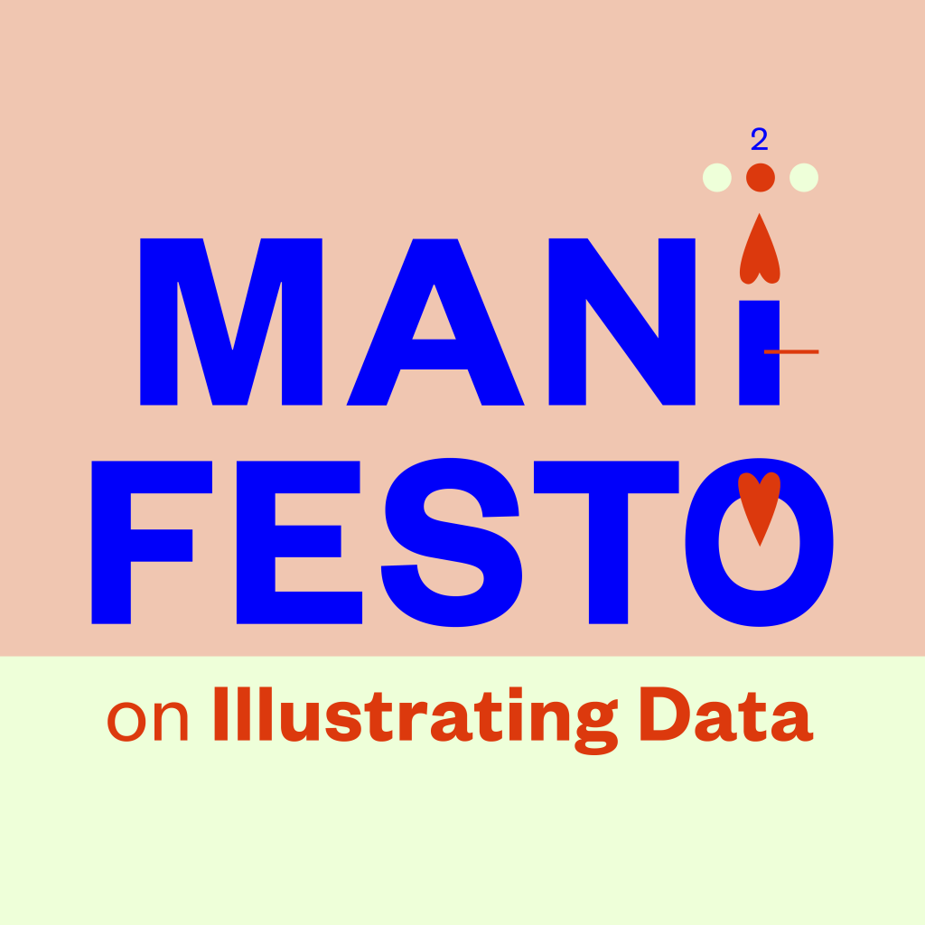
Manifesto, part 2: In a picture book, pictures come first
Picture books, alongside graphic novels and comics, are the most visual form of literature. They are a literature of pictures. Picture books are often referred to as a means to introduce children to the visual cultures of our societies. “From very early on, we both intuit and learn the language…
-
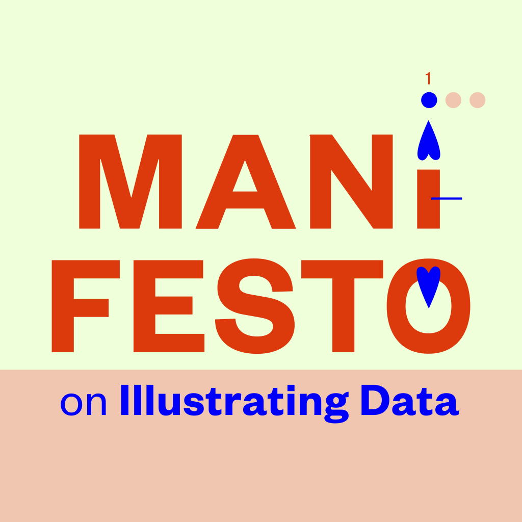
Manifesto, part 1: Approaching data starts from structure
How should one approach data in children’s literature? This manifesto is about introducing data visualization to children’s nonfiction literature. Note: I haven’t written this for children. To reach children, especially with a theme like data, one would have to use pictures more than text—not just to achieve an outcome, but…
-
Presentations of data in nonfiction picture books in the U.S.
I spent spring semester 2022 at the Simmons University’s Center for the study of Children’s Literature in Boston, MA, USA as a Fulbright Scholar. My project topic was data visualization and children’s nonfiction picture books. I beheld a lot of nonfiction picture books. I read scholarly and historical material about…
-

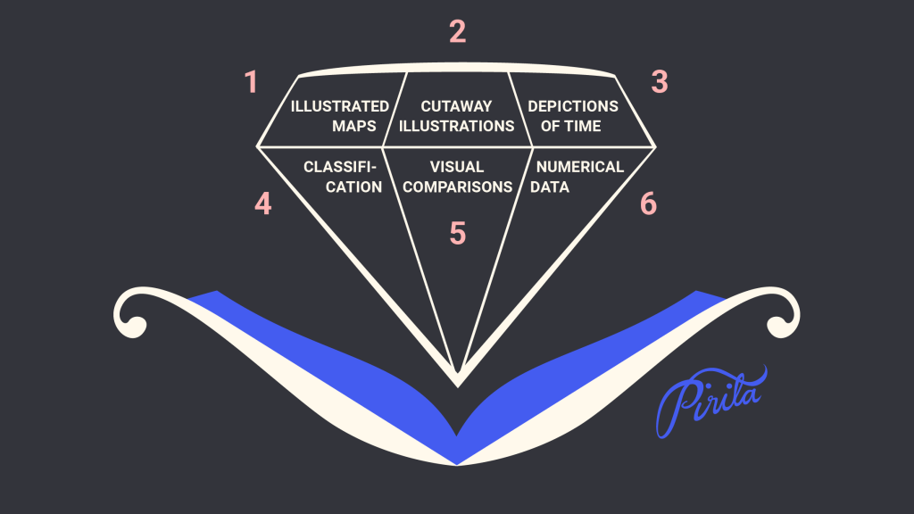
Numerical Data
“…many of us are cajoled by the mere presence of numbers and charts in the media we consume, no matter whether we can interpret them well.” Alberto Cairo: How Charts Lie – Getting Smarter about Visual Information Visual representations of numbers and numerical data are the core of my Fulbright…
-

Visual Comparisons
“Never leave a number all by itself. Never believe that one number on its own can be meaningful. If you are offered one number, always ask for at least one more. Something to compare it with.” Hans Rosling: Factfulness: Ten Reasons We’re Wrong About the World – and Why Things…
-

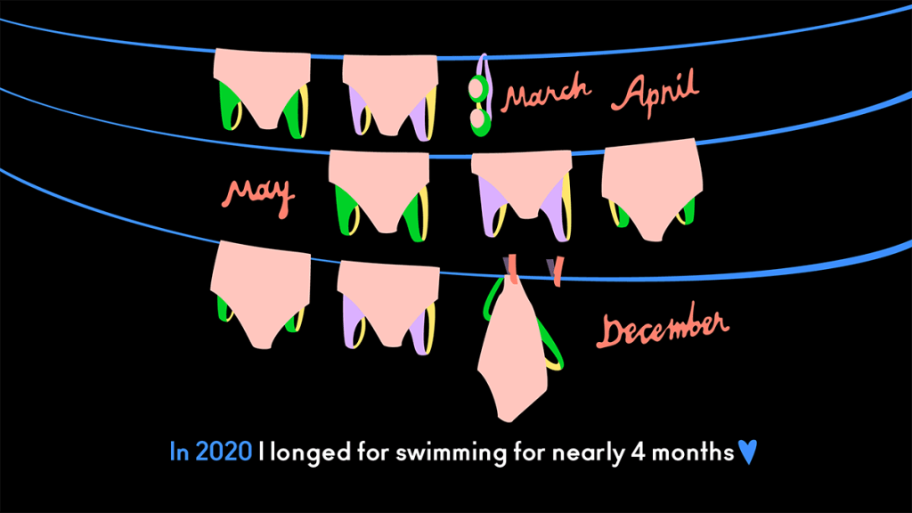
Depictions of Time
It is common to find timelines in children’s nonfiction picture books in the content or in back matter. Usually time is shown as a continuum, and the choices are made between the shape: whether it is straight (horizontal or vertical), curved or even entirely round. Timeline is often read as…
-

Cutaway Illustrations
Cutaway illustrations – including anatomy illustrations and exploded views – are very common in children’s nonfiction picture books. They are kind of like maps but on different subjects: animals, humans, plants, houses, ships…. Exploded views you often see of technical subjects. This is visual information you cannot see in real…
-
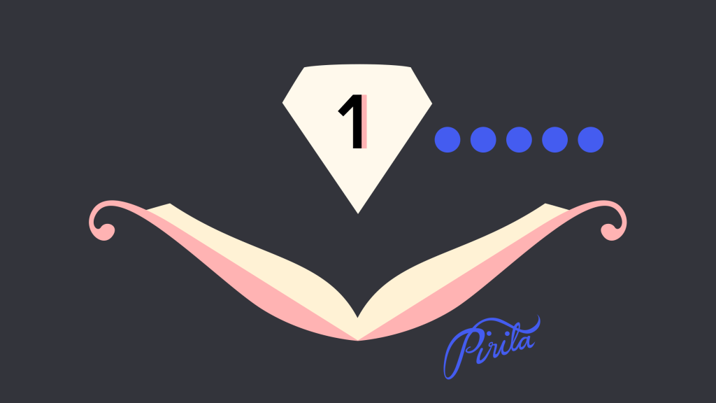
Illustrated Maps
“What is it about maps that intrigues us? Why do we pore over them endlessly? The answer can be found in an earlier era, before much of the earth was explored. Maps lessened the fear of the unknown and looked authoritative, even though there were blank spaces filled with animals,…
-
Picture this: What Illustrators do best
One of the first books Cathryn Mercier recommended for me upon arrival at the Simmons University and Center for the Study of Children’s Literature was “Picture This: How Pictures Work” by Molly Bang. It’s a charming and invigorating book, first published in 1991, and it is used in teaching at…
-
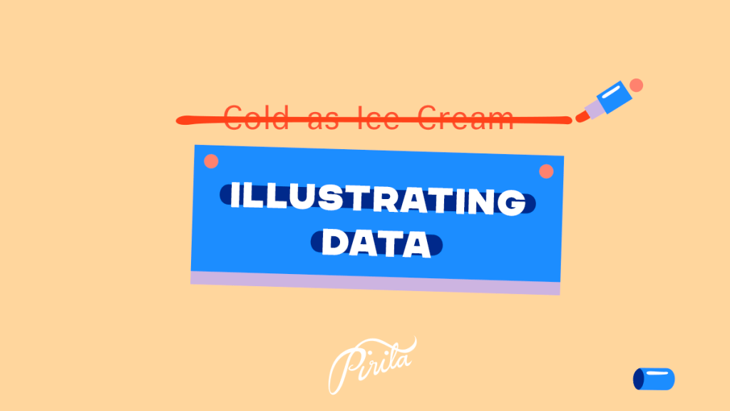
Name change: Illustrating Data
This blog used to be called “Cold as Ice Cream”, based on a Blondie song Sunday Girl. It was my visual diary that I started 2015. I will spend spring semester 2022 in Simmons University, Center for the Study of Children’s Literature in Boston, MA, USA, as a Fulbright grantee.…
