Tag: illustration
-
Picture books and PowerPoints
I remember when I first discovered it: to find good inspiration material for horizontal PowerPoint slides, it’s best to go to picture books. Picture book spreads are almost always horizontal, as are slides, especially with aspect ratio 16:9. As an illustrator and designer my first love was poster design, and…
-

Bologna 2024: Bums, blue seas and real books
A lot of talk about bums at the Bologna Children’s Book Fair this year! Bums can’t really be illustrated to children’s books in the United States. Or nudity in general. (Or dead bunnies.) Whereas in the rest of the world these are regular elements in children’s picture books. In a…
-
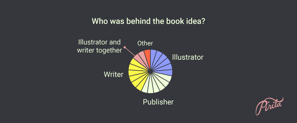
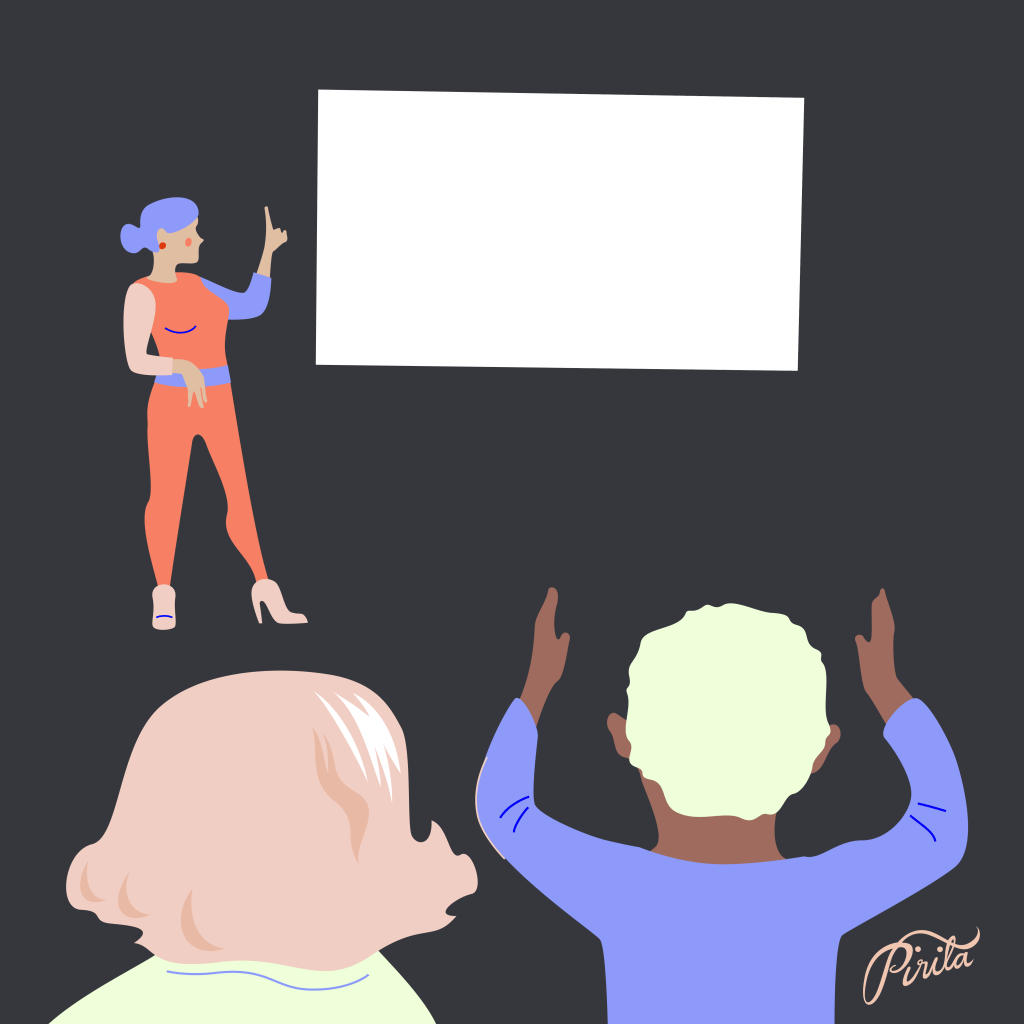
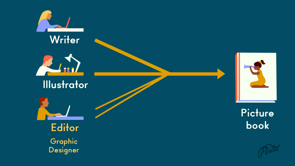
Visual workflow of nonfiction picture books
I conducted a survey for the illustrators, graphic designers and editors of the 23 nonfiction picture books published in Finland in 2021. I wanted to know how the books were made. What was the visual workflow, what were the responsibilities of each professional involved, and maybe as the main question:…
-
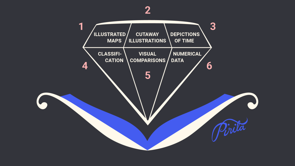
Presentations of data in nonfiction picture books in the U.S.
I spent spring semester 2022 at the Simmons University’s Center for the study of Children’s Literature in Boston, MA, USA as a Fulbright Scholar. My project topic was data visualization and children’s nonfiction picture books. I beheld a lot of nonfiction picture books. I read scholarly and historical material about…
-

Visual Comparisons
“Never leave a number all by itself. Never believe that one number on its own can be meaningful. If you are offered one number, always ask for at least one more. Something to compare it with.” Hans Rosling: Factfulness: Ten Reasons We’re Wrong About the World – and Why Things…
-
Classification
“…many twentieth-century children’s books teach the idea of list-making. What is Goodnight Moon but a catalogue of things: a list of properties both real and fanciful that mark the progress of evening and the passageway to sleep?” Seth Lerer: Children’s Literature: A Reader’s History from Aesop to Harry Potter Presentations…
-
Picture this: What Illustrators do best
One of the first books Cathryn Mercier recommended for me upon arrival at the Simmons University and Center for the Study of Children’s Literature was “Picture This: How Pictures Work” by Molly Bang. It’s a charming and invigorating book, first published in 1991, and it is used in teaching at…
-
Illustration and text go together
I have been thrilled to learn the terms ‘text-image interaction’ and ‘visual and verbal interaction’ during my Fulbright project – and get acquainted with the talk of them. For some time I had been searching for the best words to talk about this theme: I feel it combines picture books…
-
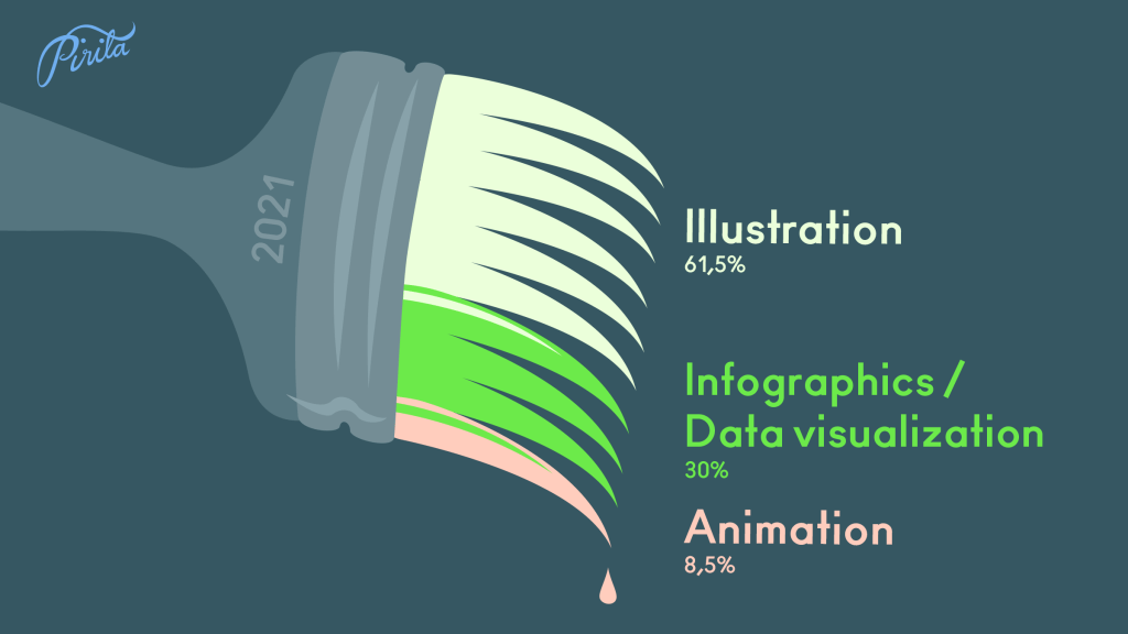
Year 2021 illustrated
I like to follow the balance between my illustration work and infographics/data visualizations. It is not always easy to draw the line, since most of my projects are a combination of both. And not rarely a project that starts out as an infographics commission ends up being an illustration –…
-
What’s so special about picture books?
There’s picture books and there’s illustrated books. To first have a text, then commission an illustrator to illustrate it, and then put it all together maybe using a graphic designer is a way to make an illustrated book. I know this is how a lot of publishers work, and their…
-
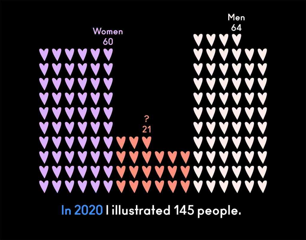
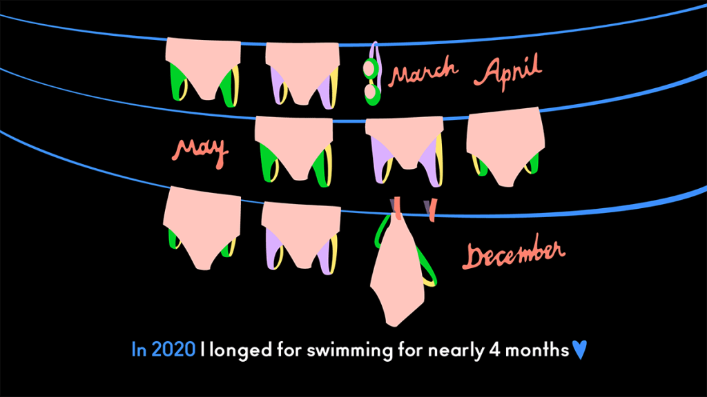
Year 2020 illustrated
My 2020’s numbers illustrated. I did this two years ago, too, and thought it’s time for an update with new numbers of the strange year. Towards new!
-

Downsizing big and bold
Two years ago I arranged an exhibition big and bold. 16 illustrations, height 2,3 meters, width 6 meters. Altogether the exhibition was nearly 100 meters wide, it was outside, and it was my first exhibition ever. No one knows how many people saw it during those 2,5 weeks, but I…
-

Five years
I started this blog in January 2015. I wanted to have a platform of my own to do something, to post something. I have done so and enjoyed! In preparing my own portfolio update recently I updated this blog first. Whilst testing out themes I compiled together the illustrations I…
-
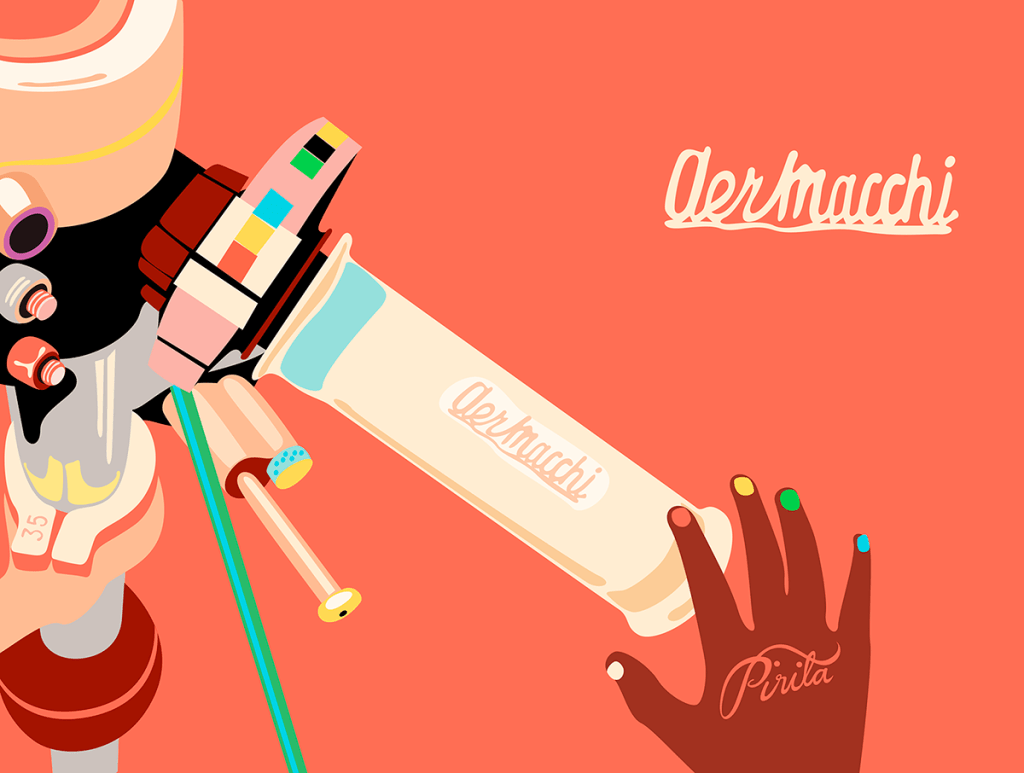
Motorcycle Stories
Alongside my very dear book project “The Baron” I drew some other motorcycles as well during last year. You can say I kinda fell for them ❤ Especially in the old race motorcycles there’s such simplicity and beauty. And the thought alone to be illustrating motorcycles for kids charmed me……


