-

Picture this: What Illustrators do best
One of the first books Cathryn Mercier recommended for me upon arrival at the Simmons University and Center for the Study of Children’s Literature was “Picture This: How Pictures Work” by Molly Bang. It’s a charming and invigorating book, first published in 1991, and it is used in teaching at…
-

Illustration and text go together
I have been thrilled to learn the terms ‘text-image interaction’ and ‘visual and verbal interaction’ during my Fulbright project – and get acquainted with the talk of them. For some time I had been searching for the best words to talk about this theme: I feel it combines picture books…
-

Year 2021 illustrated
I like to follow the balance between my illustration work and infographics/data visualizations. It is not always easy to draw the line, since most of my projects are a combination of both. And not rarely a project that starts out as an infographics commission ends up being an illustration –…
-
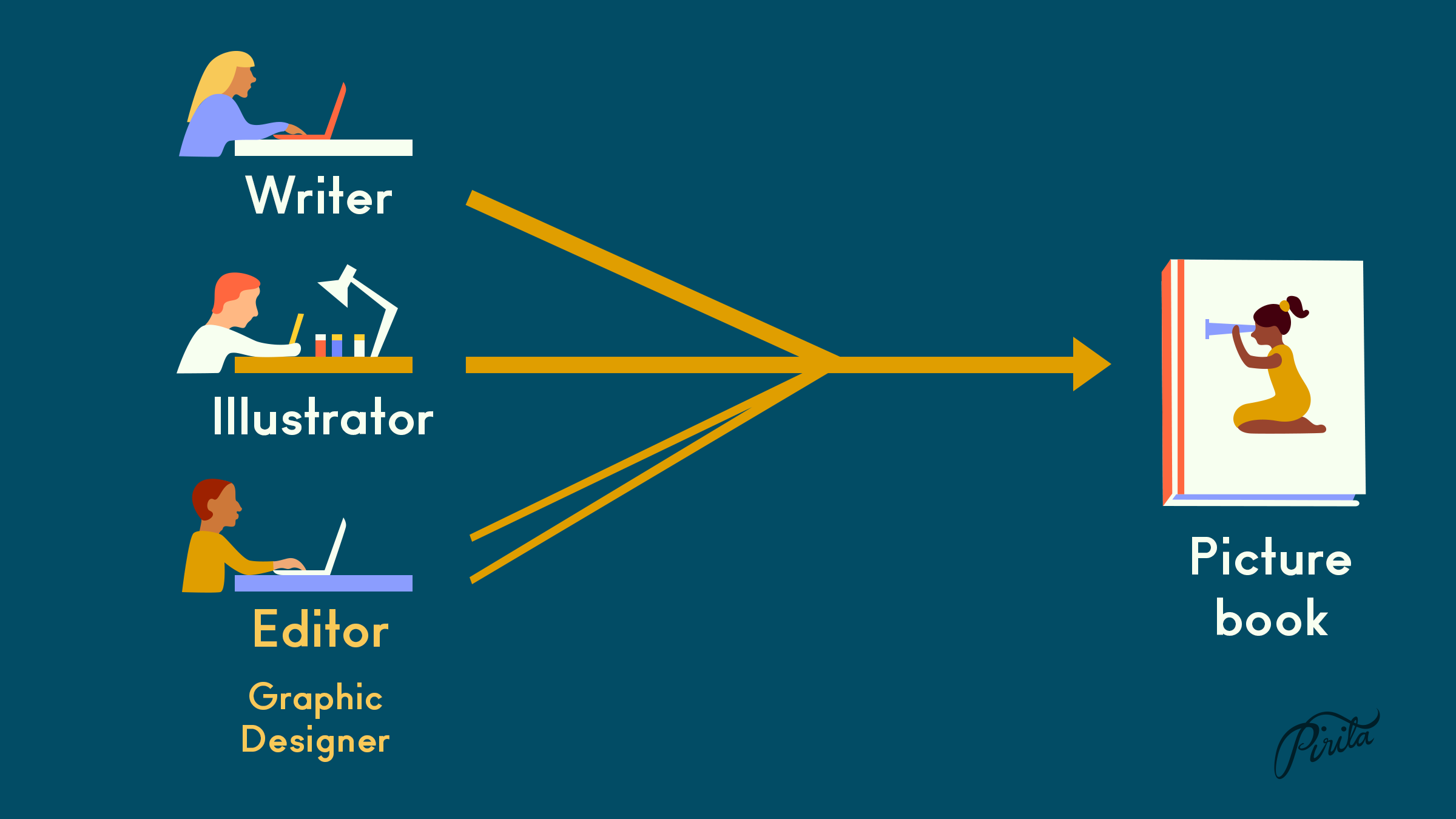
What’s so special about picture books?
There’s picture books and there’s illustrated books. To first have a text, then commission an illustrator to illustrate it, and then put it all together maybe using a graphic designer is a way to make an illustrated book. I know this is how a lot of publishers work, and their…
-
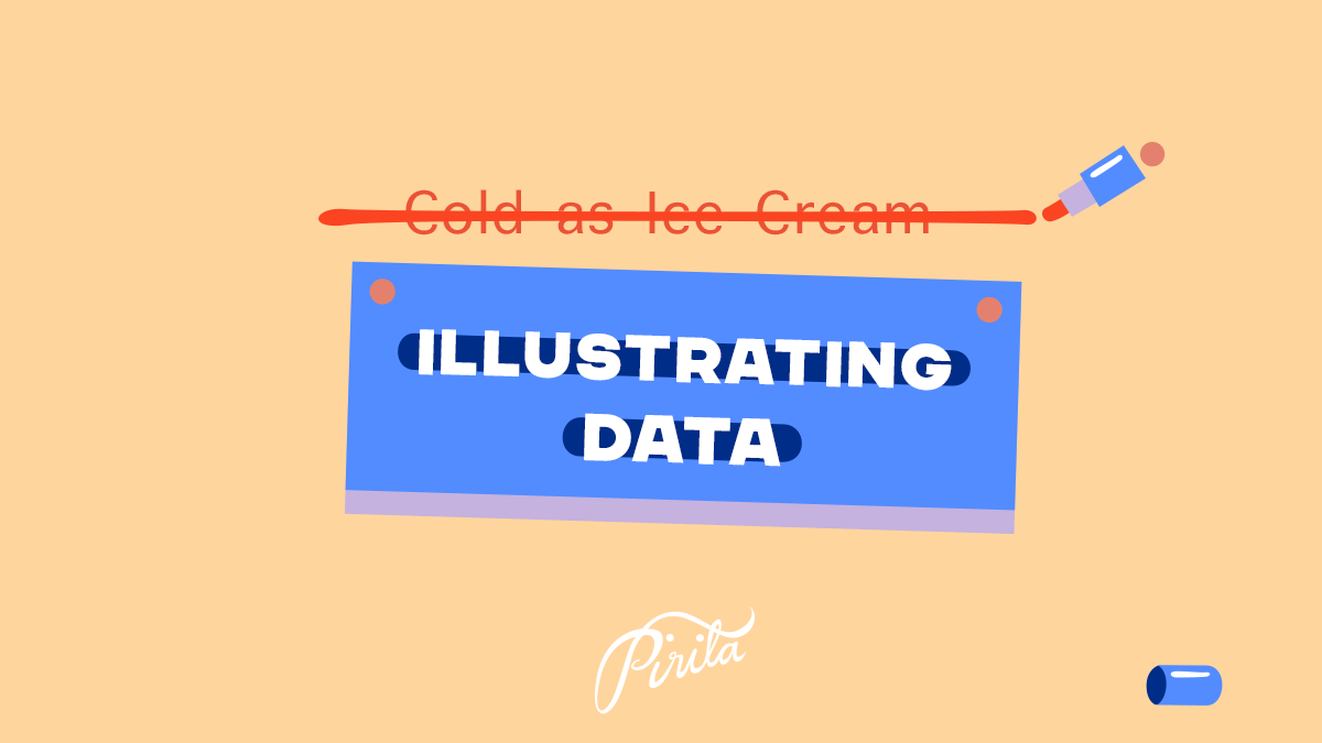
Name change: Illustrating Data
This blog used to be called “Cold as Ice Cream”, based on a Blondie song Sunday Girl. It was my visual diary that I started 2015. I will spend spring semester 2022 in Simmons University, Center for the Study of Children’s Literature in Boston, MA, USA, as a Fulbright grantee.…
-
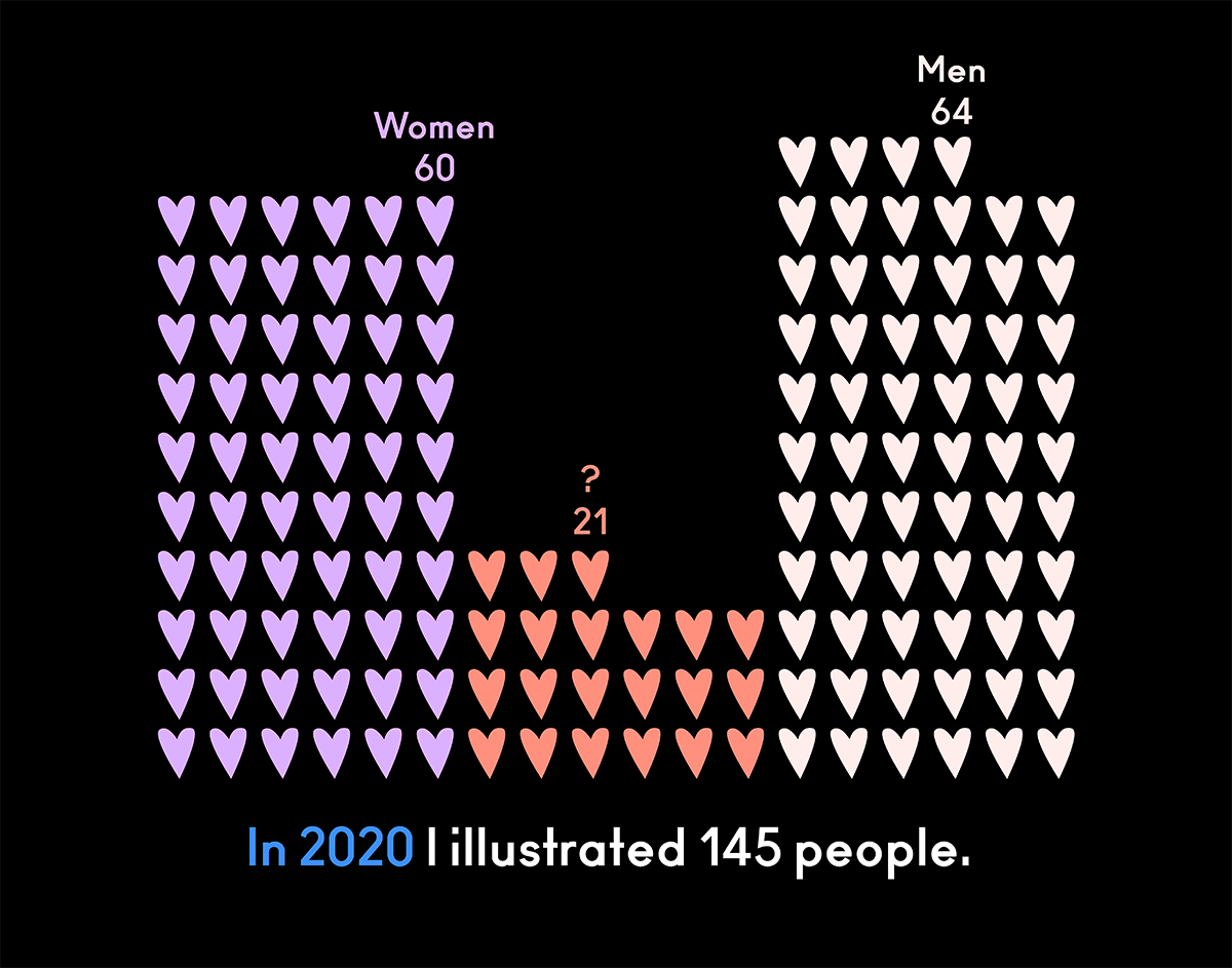
Year 2020 illustrated
My 2020’s numbers illustrated. I did this two years ago, too, and thought it’s time for an update with new numbers of the strange year. Towards new!
-
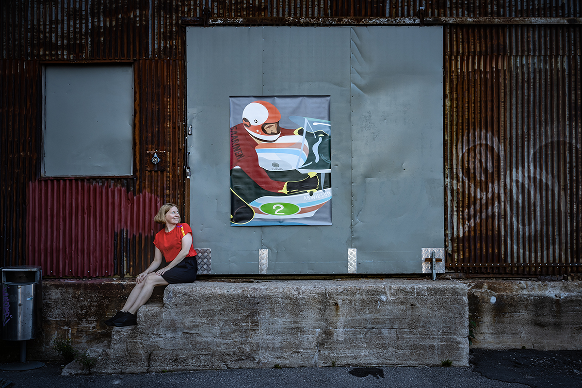
Downsizing big and bold
Two years ago I arranged an exhibition big and bold. 16 illustrations, height 2,3 meters, width 6 meters. Altogether the exhibition was nearly 100 meters wide, it was outside, and it was my first exhibition ever. No one knows how many people saw it during those 2,5 weeks, but I…
-
You’re the designer
“Longest way round is the shortest way home”, wrote James Joyce, and Debbie Millman with her story illustrated the sentiment aptly. In her keynote speech at the Huiput Creative Festival in Helsinki Millman focused on rejections and walked us through her career – and the worst day of her life.…
-

Five years
I started this blog in January 2015. I wanted to have a platform of my own to do something, to post something. I have done so and enjoyed! In preparing my own portfolio update recently I updated this blog first. Whilst testing out themes I compiled together the illustrations I…
-

Motorcycle Stories
Alongside my very dear book project “The Baron” I drew some other motorcycles as well during last year. You can say I kinda fell for them ❤ Especially in the old race motorcycles there’s such simplicity and beauty. And the thought alone to be illustrating motorcycles for kids charmed me……


-
Subscribe
Subscribed
Already have a WordPress.com account? Log in now.
