One of the first books Cathryn Mercier recommended for me upon arrival at the Simmons University and Center for the Study of Children’s Literature was “Picture This: How Pictures Work” by Molly Bang. It’s a charming and invigorating book, first published in 1991, and it is used in teaching at the Simmons’ children’s literature program’s The Picturebook course.
The book shows how the structural elements in a picture affect our emotions. How we perceive shapes, colors and other compositional elements of a scene within the context of our own experience.
As an illustrator I found a lot in the book familiar and something I had knowingly and intuitively been following along. To read it through wasn’t tiresome, quite the opposite. Bang presents her insights and principles with such curiosity and zest that it was hard to stop reading. Or learning.
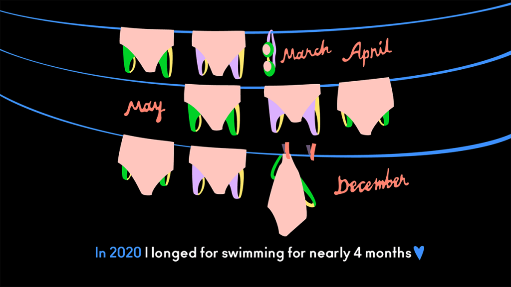
Illustrators work with pictures. They know how to make them scary, joyful, serene or sad. Below is an illustration from my personal project: summary of the year 2020. I will apply a couple of Bang’s principles and notions on it.

Bang’s 1st principle: “Smooth, flat, horizontal shapes give us a sense of stability and calm.”
I thought of this as a calm, centered illustration that would present its information horizontally in rows (wavy clotheslines) and could have a hint of longing to it. The pools were closed starting early March until the beginning of June and then again they closed towards the end of November.
Bang’s 6th principle: “White or light backgrounds feel safer to us than dark backgrounds because we can see well during the day and only poorly at night.”
The background color for all of these images was black or dark purple. I knew its effect – it was 2020 I was talking about!
I chose blue as a hint to the water that I was missing. And red for the words of months when that missing happened. White is the strongest contrast on a black background, that’s why the main narrative (text) is white, but this slightly pale red would be strong, too, and it would catch attention only how red does. It would tell different things.
Bang writes: “What is red? Blood and fire.”
From emotions to data
“When I was making the illustrations, my husband suggested I decide on the emotion in every picture before I begin it, and that I make that feeling very clear”, Bang writes.
I think what Bang writes is true with data, too. Whether it’s an illustration or a story on data, the illustrator has to know the data in every illustration before they begin it, and make that data very clear. Otherwise the message might get lost or blurry.
Illustrators have an incredible skillset in making pictures that affect our emotions. They know what Bang is talking about. What if illustrators could use those skills on illustrating data?
This is the question I am pondering in my project. What would data visualization look like if it were made by illustrators and aimed at children?
What do you think?

Leave a comment