Tag: Picture Books
-
Picture books and PowerPoints
I remember when I first discovered it: to find good inspiration material for horizontal PowerPoint slides, it’s best to go to picture books. Picture book spreads are almost always horizontal, as are slides, especially with aspect ratio 16:9. As an illustrator and designer my first love was poster design, and…
-
Manifesto, part 2: In a picture book, pictures come first
Picture books, alongside graphic novels and comics, are the most visual form of literature. They are a literature of pictures. Picture books are often referred to as a means to introduce children to the visual cultures of our societies. “From very early on, we both intuit and learn the language…
-
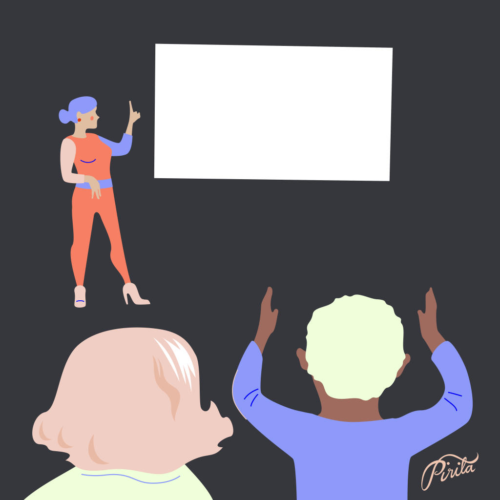
Manifesto, part 1: Approaching data starts from structure
How should one approach data in children’s literature? This manifesto is about introducing data visualization to children’s nonfiction literature. Note: I haven’t written this for children. To reach children, especially with a theme like data, one would have to use pictures more than text—not just to achieve an outcome, but…
-
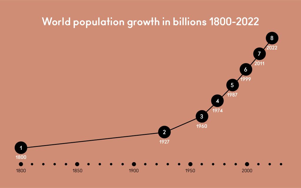
Time: Lines or stories?
Looking through nonfiction picture books in my research I started to notice timelines in which time was not visualized properly. Often, they were events in time placed side by side with or without a line. Like this: It does look like a timeline. But time isn’t actually visualized: it’s numerical…
-
Bologna 2023: Beauty, censorship and data
I gave a masterclass talk on Data Visualization and Nonfiction Picture Books on March 8th, at the Bologna Children’s Book Fair in Bologna, Italy. Thank you everyone who came! I had a focused audience that asked brilliant questions (“Can you show examples of emotional structures in data illustrations?” I will…
-
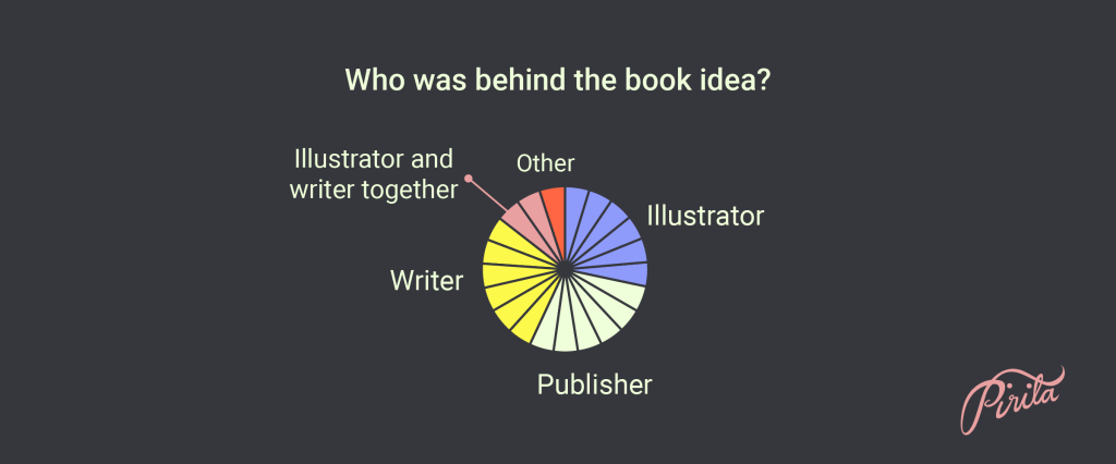
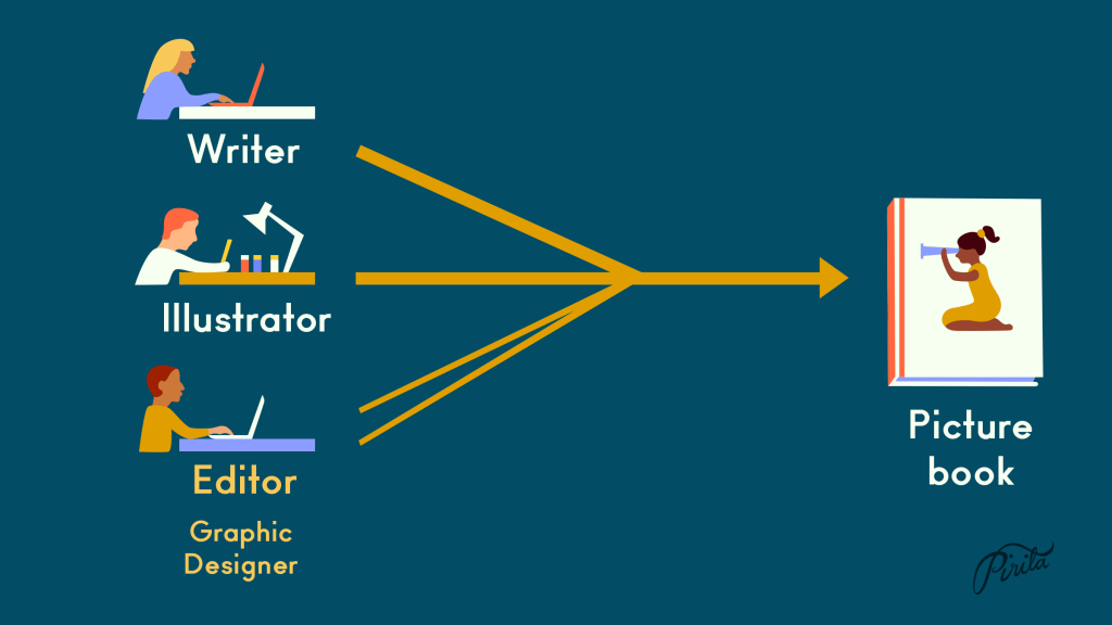
Visual workflow of nonfiction picture books
I conducted a survey for the illustrators, graphic designers and editors of the 23 nonfiction picture books published in Finland in 2021. I wanted to know how the books were made. What was the visual workflow, what were the responsibilities of each professional involved, and maybe as the main question:…
-
Presentations of data in nonfiction picture books in the U.S.
I spent spring semester 2022 at the Simmons University’s Center for the study of Children’s Literature in Boston, MA, USA as a Fulbright Scholar. My project topic was data visualization and children’s nonfiction picture books. I beheld a lot of nonfiction picture books. I read scholarly and historical material about…
-

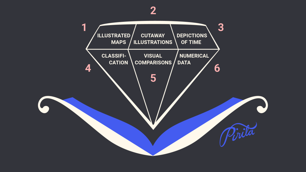
Visual Comparisons
“Never leave a number all by itself. Never believe that one number on its own can be meaningful. If you are offered one number, always ask for at least one more. Something to compare it with.” Hans Rosling: Factfulness: Ten Reasons We’re Wrong About the World – and Why Things…
-

Depictions of Time
It is common to find timelines in children’s nonfiction picture books in the content or in back matter. Usually time is shown as a continuum, and the choices are made between the shape: whether it is straight (horizontal or vertical), curved or even entirely round. Timeline is often read as…
-

Cutaway Illustrations
Cutaway illustrations – including anatomy illustrations and exploded views – are very common in children’s nonfiction picture books. They are kind of like maps but on different subjects: animals, humans, plants, houses, ships…. Exploded views you often see of technical subjects. This is visual information you cannot see in real…
-
Picture this: What Illustrators do best
One of the first books Cathryn Mercier recommended for me upon arrival at the Simmons University and Center for the Study of Children’s Literature was “Picture This: How Pictures Work” by Molly Bang. It’s a charming and invigorating book, first published in 1991, and it is used in teaching at…
-
What’s so special about picture books?
There’s picture books and there’s illustrated books. To first have a text, then commission an illustrator to illustrate it, and then put it all together maybe using a graphic designer is a way to make an illustrated book. I know this is how a lot of publishers work, and their…
-
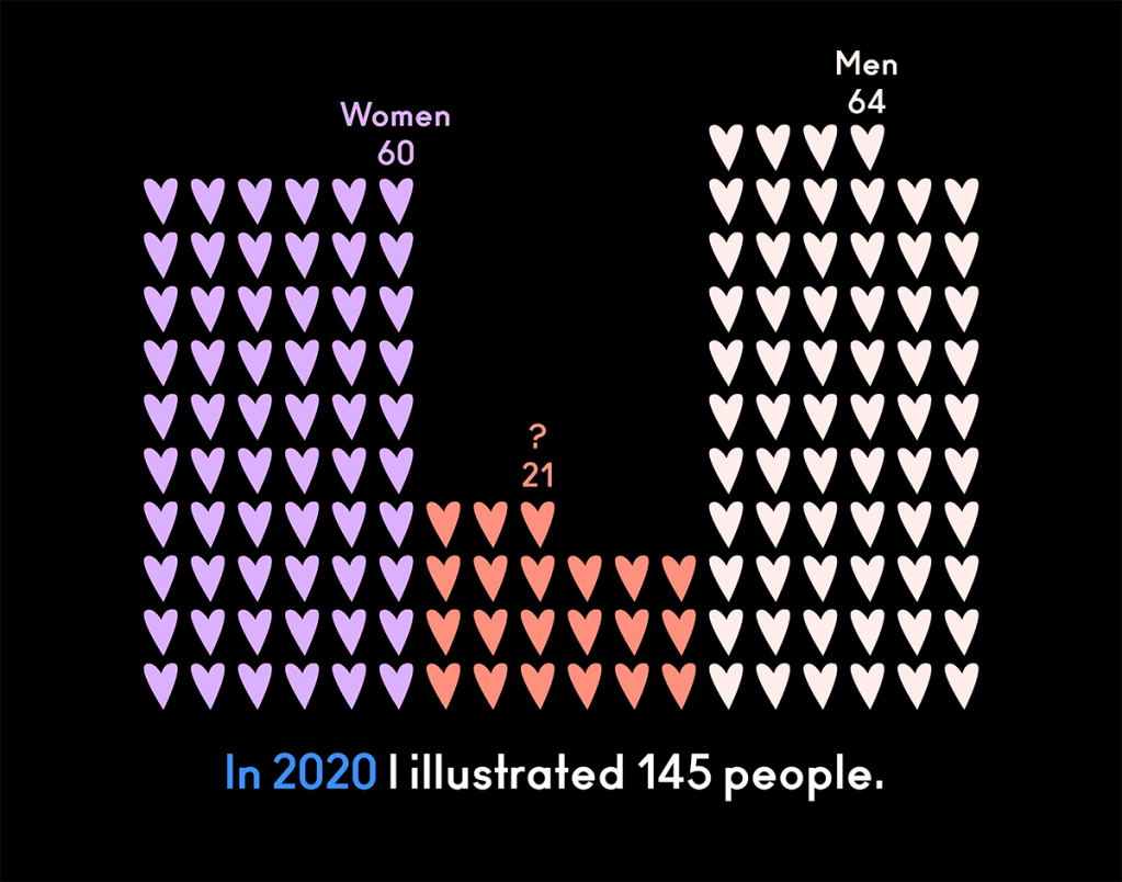
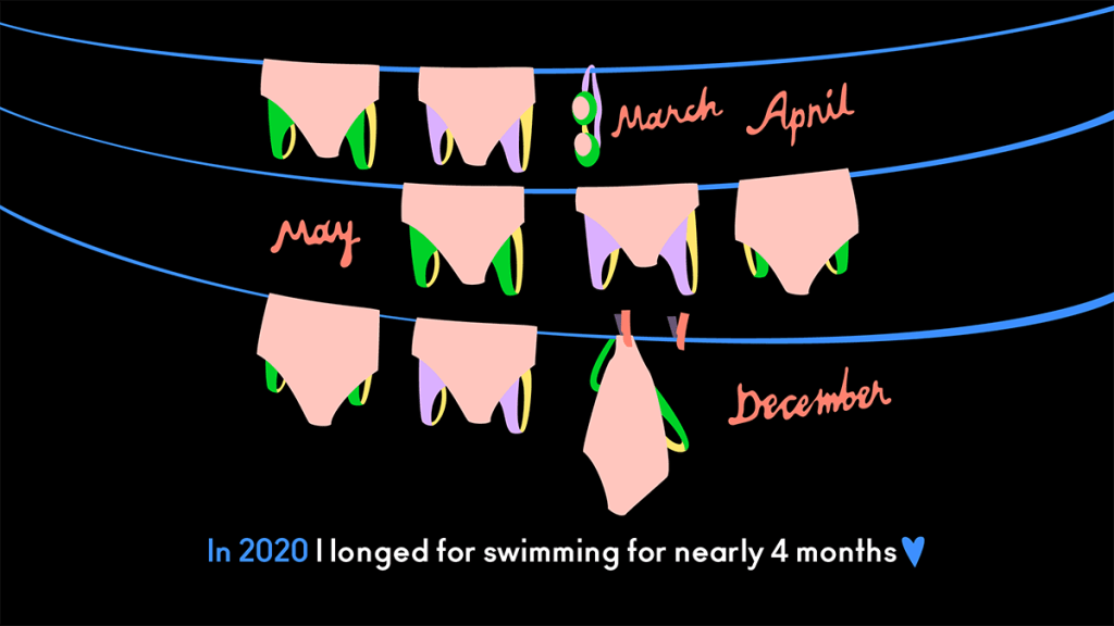
Year 2020 illustrated
My 2020’s numbers illustrated. I did this two years ago, too, and thought it’s time for an update with new numbers of the strange year. Towards new!

