Tag: children's literature
-
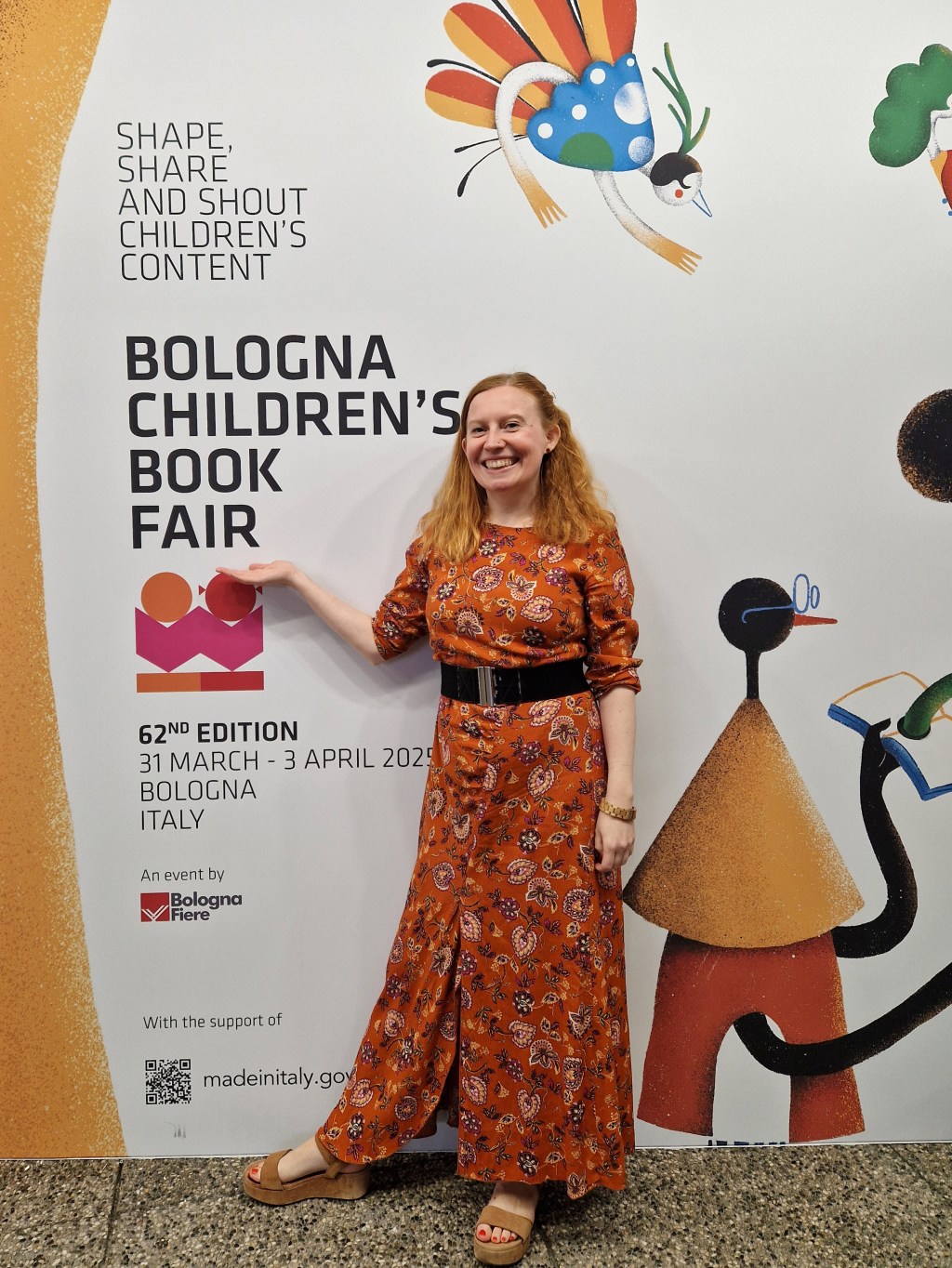
Bologna 2025: Boys, blouses and a shared reality
Sustainability headlined the 2025 Bologna Children’s Book Fair, where Mary E. Glenn of UN Publications noted during the Sustainability Summit that “the rise in media misinformation, especially on social media, is a challenge because sustainability depends on having a shared reality.” For me, that was the key sentiment of the…
-
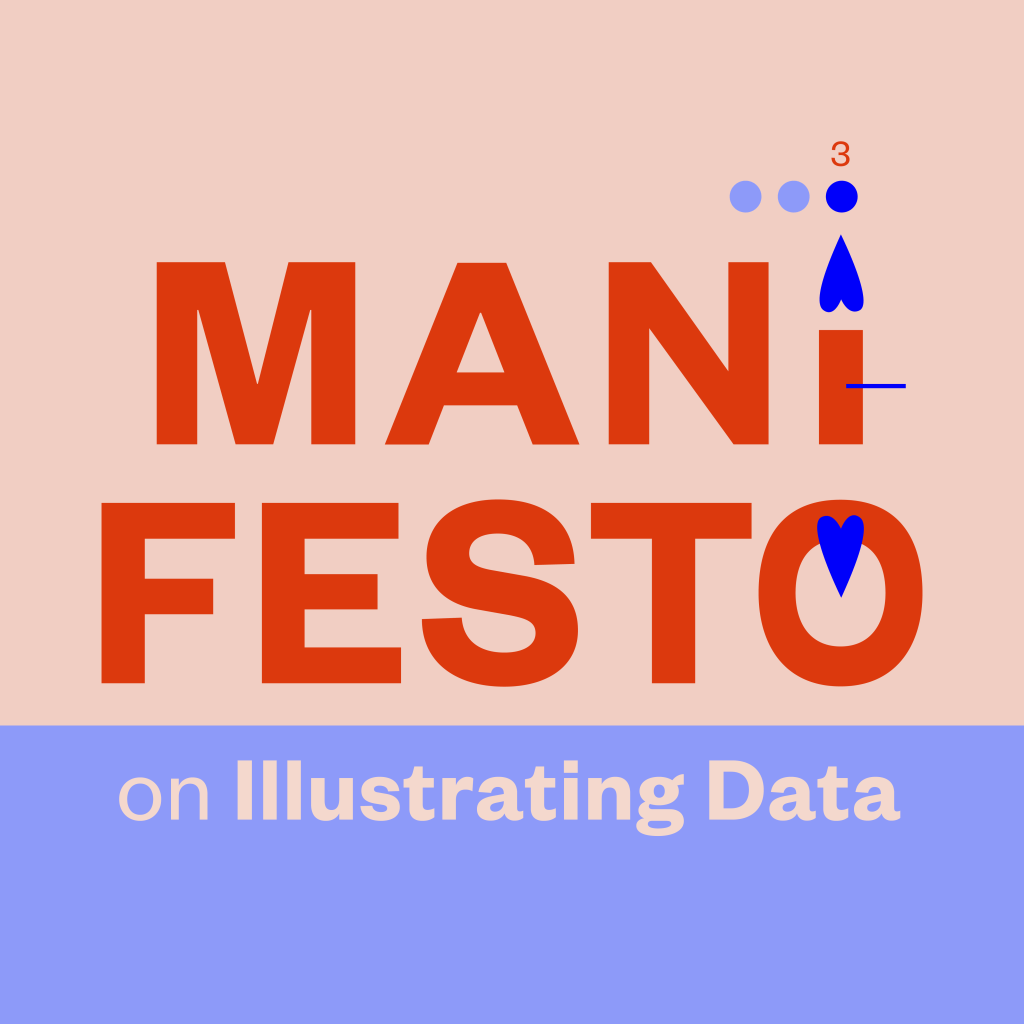
Manifesto, part 3: With data, we need pictures
In Manifesto’s part 1, I wanted to show how expository nonfiction can be a way to approach data visualization on a structural level, with an example of nonfiction illustration’s direct, straightforward way of communicating. In Manifesto’s part 2 I focused on the New Nonfiction Picturebook and added a numerical dimension…
-

Bologna 2024: Bums, blue seas and real books
A lot of talk about bums at the Bologna Children’s Book Fair this year! Bums can’t really be illustrated to children’s books in the United States. Or nudity in general. (Or dead bunnies.) Whereas in the rest of the world these are regular elements in children’s picture books. In a…
-
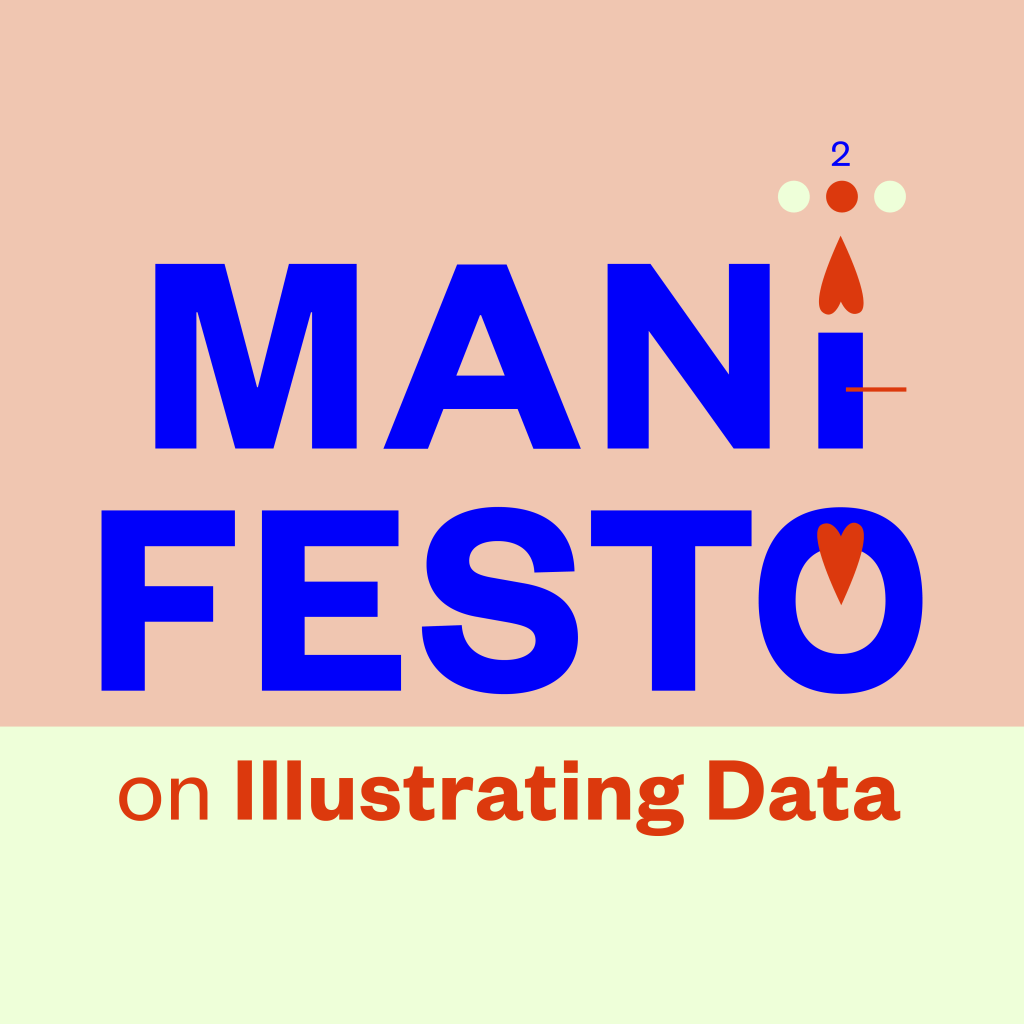
Manifesto, part 2: In a picture book, pictures come first
Picture books, alongside graphic novels and comics, are the most visual form of literature. They are a literature of pictures. Picture books are often referred to as a means to introduce children to the visual cultures of our societies. “From very early on, we both intuit and learn the language…
-
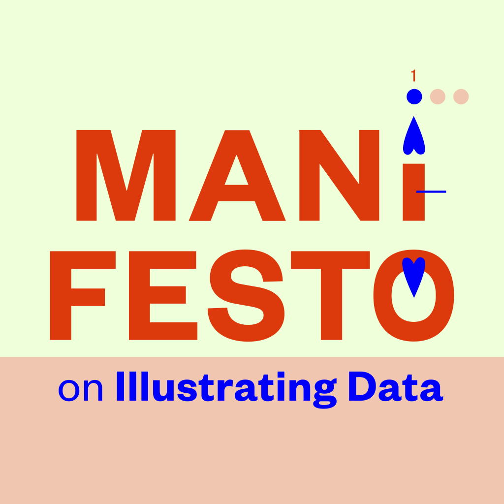
Manifesto, part 1: Approaching data starts from structure
How should one approach data in children’s literature? This manifesto is about introducing data visualization to children’s nonfiction literature. Note: I haven’t written this for children. To reach children, especially with a theme like data, one would have to use pictures more than text—not just to achieve an outcome, but…
-
Presentations of data in nonfiction picture books in the U.S.
I spent spring semester 2022 at the Simmons University’s Center for the study of Children’s Literature in Boston, MA, USA as a Fulbright Scholar. My project topic was data visualization and children’s nonfiction picture books. I beheld a lot of nonfiction picture books. I read scholarly and historical material about…
-

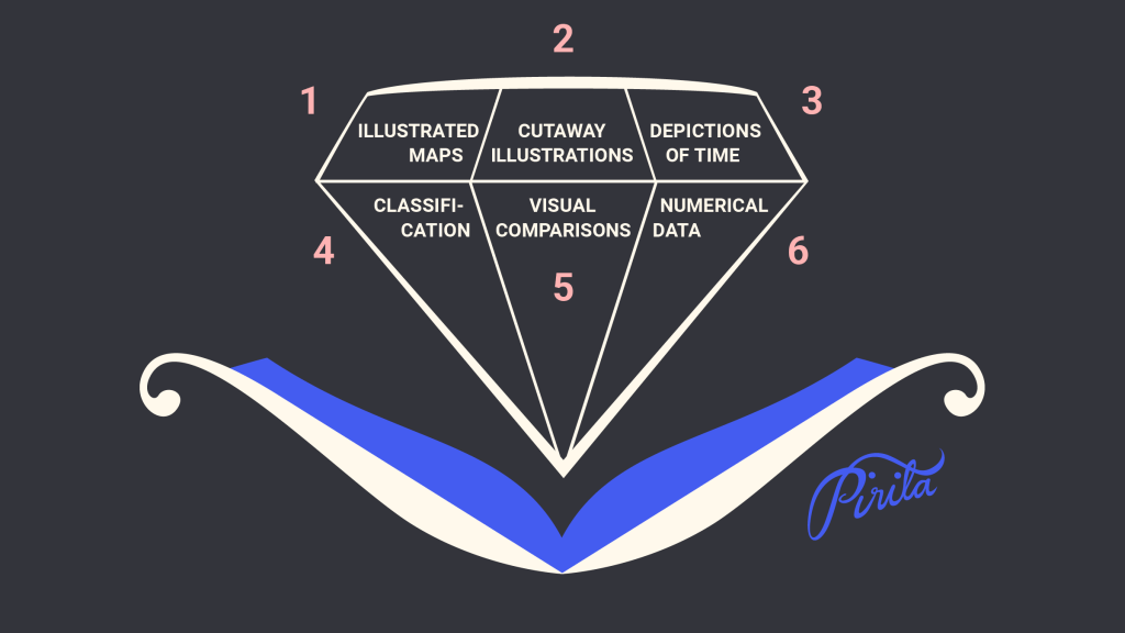
Numerical Data
“…many of us are cajoled by the mere presence of numbers and charts in the media we consume, no matter whether we can interpret them well.” Alberto Cairo: How Charts Lie – Getting Smarter about Visual Information Visual representations of numbers and numerical data are the core of my Fulbright…
-

Visual Comparisons
“Never leave a number all by itself. Never believe that one number on its own can be meaningful. If you are offered one number, always ask for at least one more. Something to compare it with.” Hans Rosling: Factfulness: Ten Reasons We’re Wrong About the World – and Why Things…
