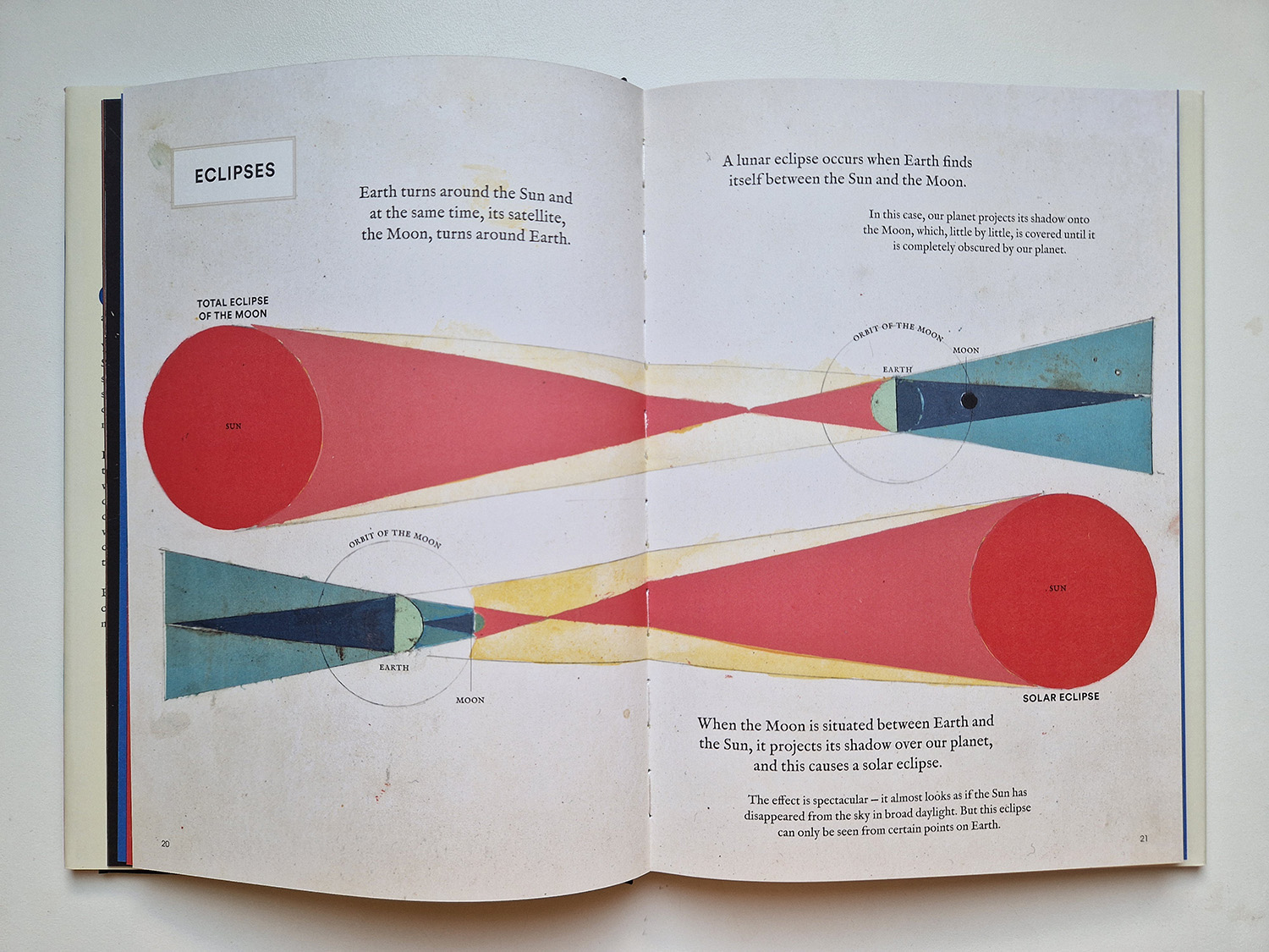
Geo-Graphics by Regina Giménez (Levine Querido 2022) is a nonfiction picture book consisting of different kinds of shapes (and sizes) that all communicate mostly geographical data. The book shows us facts about the universe surrounding us: diameters of planets, sizes of continents, heights of mountains, length of rivers, ocean depths, to precipitation and greenhouse gas emissions.

The style Gimenez uses is very handcrafted-looking, especially when you look at it from the point of data visualization. The book’s visuals consist basically of color and organic shapes.

The data the book presents is data of the world surrounding us; and we live in the middle. People are not there, nor are any characters of any kind. For a picture book, there is quite a lot of text, and I would prefer the text in the paragraphs to be aligned left instead of centering in order to make reading easier.
One might say that Geo-Graphics is not actually for children, and the amount of text and the font selections would lean towards that. But I think it is; it could be, even though it undoubtedly is of interest to adults with a penchant for visual literacy.
I don’t think anyone knows what these pictures are about or how to read them when seeing them for the first time.

These are shapes and colours children appreciate and might very well be interested in exploring. These are pictures that invite you to spend time with them. That is how you figure out their secrets. They are not that mysterious, if you give them time and attention.
One might call this book design-oriented. The visuals look like art. Some of these spreads could be abstract paintings. Can we even mention illustration while talking about this book?
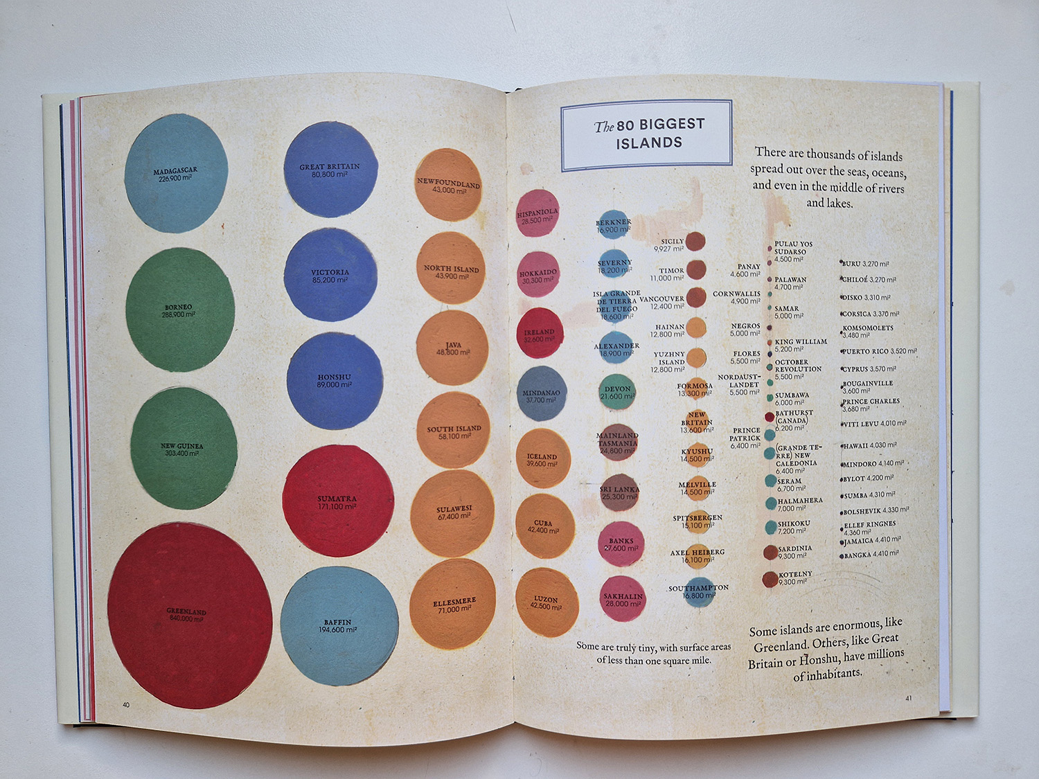
Data is plural, data is many; data is abstract, I write in my Manifesto on Illustrating Data. With this book Gimenez illustrates those qualities poignantly and beautifully.
Data with characters
Data literacy is needed in this time we are living in, and children need to learn to read data. Friends Beyond Measure by Lalena Fisher (HarperCollins 2023) is a more thorough and complex dive into data than you even realize at a first glance. Besides a picture book creator, Fisher is a New York Times infographics contributor.
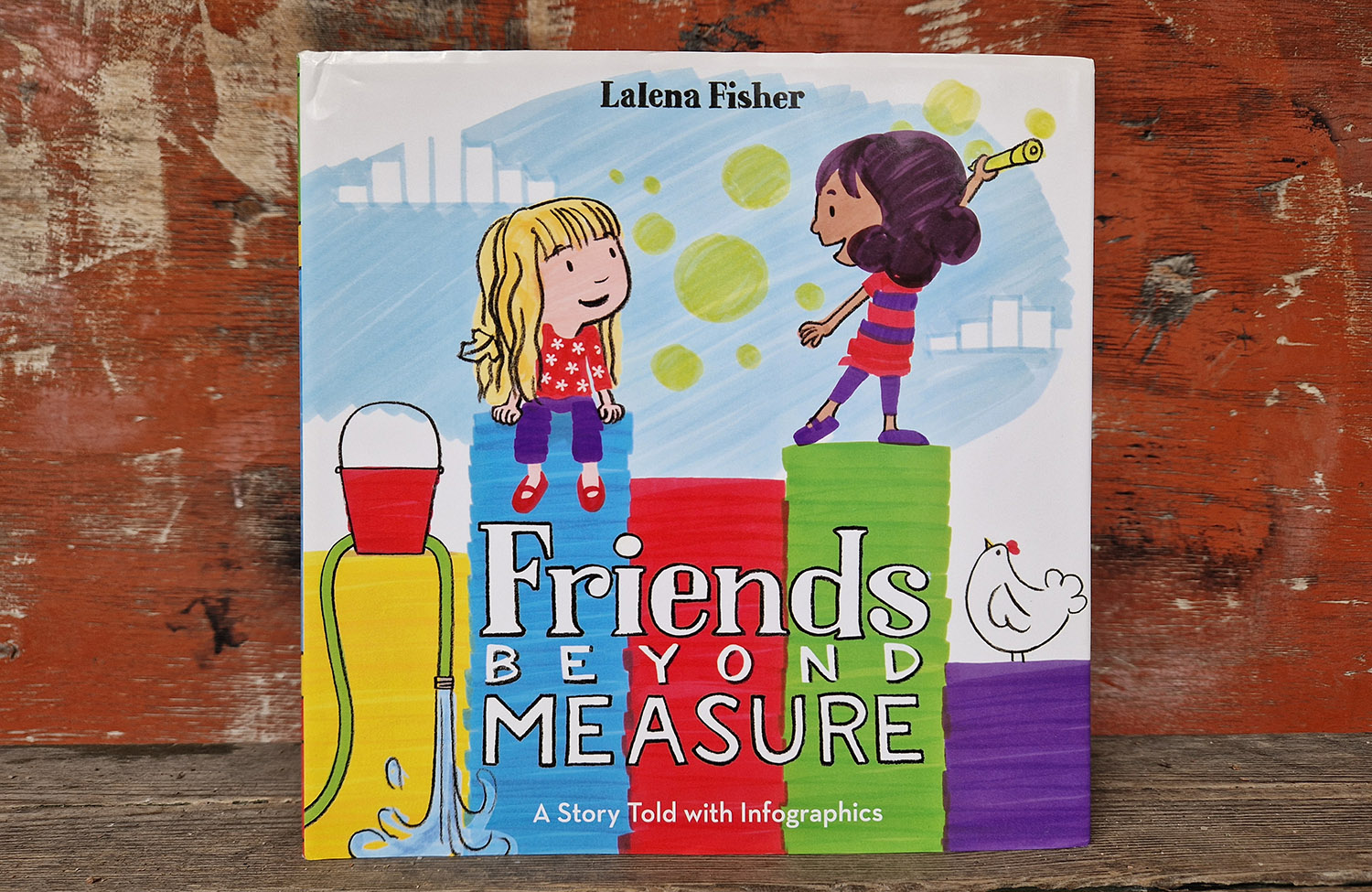
Like in Geo-Graphics, the illustration style looks handcrafted. Fisher uses markers and pencil for illustrating. The style as well as the technique is very kid-friendly and welcoming. It says: “You can do it, too. Give it a go!”
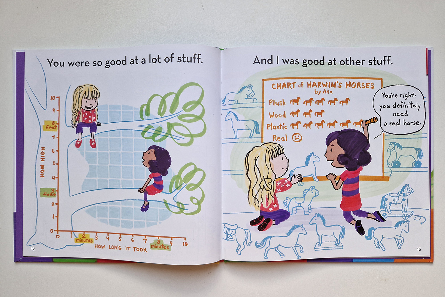
The biggest and rather obvious distinction to Geo-Graphics is that there are characters on every spread. Often other elements as well; family members, trees, toys etc. The two friends, Harwin and Ana, are about to be separated from one another, as Harwin’s family is moving away. They are figuring through their emotions and practical matters. And they are doing it – or the book is doing it – through data visualizations.
So the data is fiction; it’s springing out from the fictive story we are reading. But because we are drawn into the story, we want to know what the data says.
This is a clever way to introduce data visualization to children.
There are pie charts, timelines, flow charts, maps, coordinate charts… with a helpful glossary in the end.
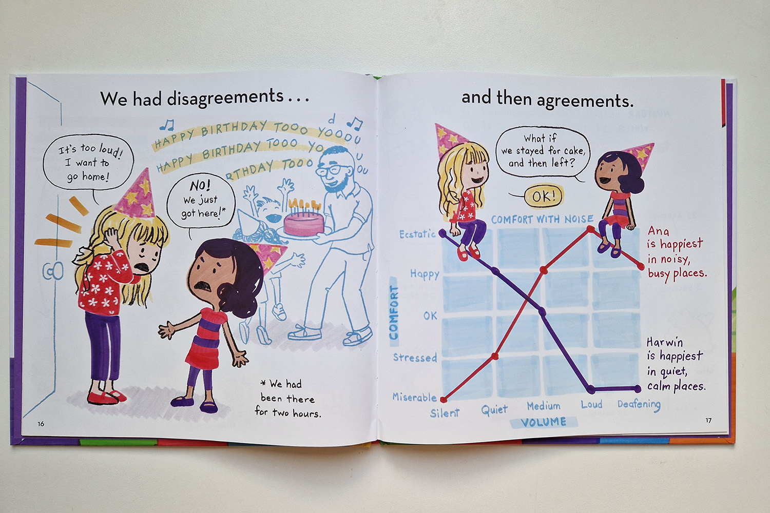
My favorite spread of the book is this one. The most important point of interest on the spread is the bar depicting shock; presented using red. It’s the biggest bar, the one that Ana lays on (looking defeated). It’s clearly the biggest emotion habitating her.
But there are others feelings, too. The second biggest bar is sadness, in blue. The smallest bar is “Excitement for you”; located right in front of Harwin, in sympathetic yellow.
The illustration is built in a clever way. There is a path going round; from shock and Ana to other feelings and then to excitement and Harwin, and then back to Ana from the look from Harwin’s eyes.
(I think everyone should draw a chart like this of themselves in times of emotional turmoil!)
Data and empathy
At the Visualizing Knowledge 2025 conference in Helsinki in June 2025, Anastasiia Balagurova talked about empathy and data. On her website Numbers Meet Empathy Balagurova has a showcase of projects with data visualizations showing empathy. She has created a list of techniques that can be used to make data visualization more empathetic.
I picked the ones that resonate best with children’s nonfiction. I have also reflected them above in looking at Geo-Graphics and Friends Beyond Measure.
(How to) ADDRESS SENSATIONS
- Handcrafted style
- True-life imagery
- Data with a human face
- Visual metaphor
- Organic shape
- Color
Handcrafted style or a look of handcrafted can often be found in children’s nonfiction. In certain informational illustration’s fields such as scientific or medical illustration, there is a tradition to appreciate realism and neutrality high (understandably). You can sometimes see that in children’s nonfiction, too, but it has started to develop towards a wider usage and understanding of illustration styles and how they all can be utilized in nonfiction.
(How to) SHAPE NARRATIVE
- One element, one life
- Real-life story in focus
Children’s literature knows story. Especially a story focused on one main character. There isn’t a lacking of narrative elements in children’s nonfiction. Those elements that are usually craved for when the phrase storytelling with data is used.
But the structural and expository elements that are so essential to data visualization, could be more familiar to the world of children’s nonfiction literature. Especially nonfiction picture books could utilize them more. It is a format fit for them. (I write about this in my Manifesto on Illustrating Data, especially in the part 1: Approaching data starts from structure)
The showcase includes one of Balagurova’s own project, the Birdsong of sorrow above Ukraine. It is a visualization of lost civilian lives in the war in Ukraine. It is an articulate example of one element, one (lost) life technique: A white bird represents an adult life lost, a light blue bird represents a child. The birds are a beautiful and emotional visual metaphor for lives lost.

The visualization is very illustration-friendly. The birds have a hand-crafted quality to them, as does the background. The shape of the birds is rather organic.
The Numbers Meet Empathy showcase and its techniques are an interesting approach not only to empathy in data visualization, but more generally, to data visualization.
Main illustration: Pirita Tolvanen
Birdsong of sorrow above Ukraine: Anastasiia Balagurova
Interested in more? Subscribe to my newsletter!

Leave a comment