In Manifesto’s part 1, I wanted to show how expository nonfiction can be a way to approach data visualization on a structural level, with an example of nonfiction illustration’s direct, straightforward way of communicating. In Manifesto’s part 2 I focused on the New Nonfiction Picturebook and added a numerical dimension to the picture book’s visual and verbal communication.
Here in Manifesto’s part 3, I’m finally getting to the actual data visualizations.
When blogger Betsy Bird writes in her article of 31 Days, 31 Lists: 2023 Math Books for Kids how “With the given understanding that infographics are, almost by definition, more interesting to adults than they are to kids”, I very well know what she means. As someone who’s paid her bills for the past decade with illustrating infographics, I know much about the interest adults have had on infographics for quite some time now.
Early on in my project I ruled out nonfiction books with infographics in their title. The main reason was that I felt they were addressing an audience already interested in the subject. I try to avoid the word infographics when I can: it is easier to grasp for most people than data visualization is, but it doesn’t take us far. Infographics are explanatory whereas data visualization is exploratory. The way I see it, we tend to think of information as text, but with data we know plain text won’t get us far. With data we need pictures. We all need them; not just the ones already interested in the subject.
“Do picture book makers get a little insecure or shy with numbers? I often wonder, looking at creative, clever, gorgeous nonfiction picture books that could tell about their themes through numbers, too, but they don’t.”
Presentations of Numerical Data in Nonfiction Picture Books in the U.S. / Illustrating Data 30.6.2022
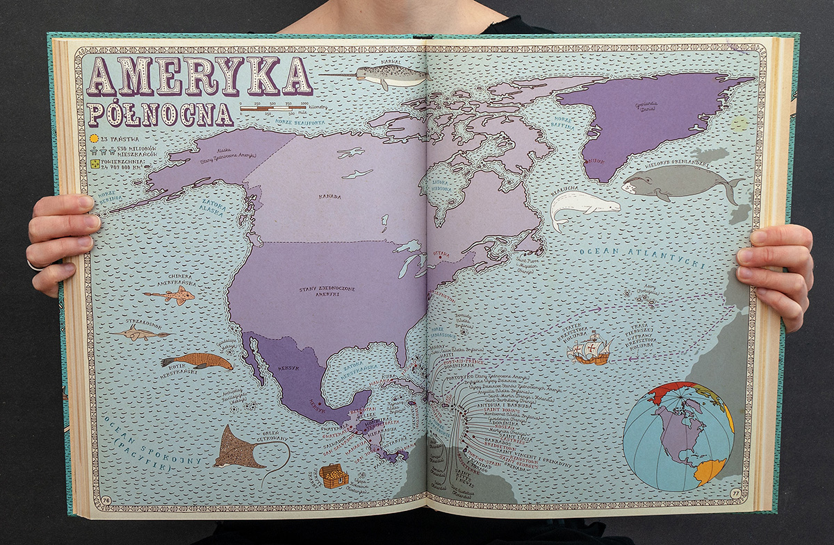
In the last couple years I have read through hundreds of nonfiction picture books and paid attention to their ways of visualizing information and data. I did think I would find more numerical data visualizations in children’s nonfiction picture books than I ended up finding. When you do find numerical visualizations, it is usually timelines, visual comparison of size, height, length or area, and sometimes quantities. Maps can be found very often.

What can be found, though, are numbers. Let’s go back to the triangle I first presented in the Manifesto’s part 2. Most of the numbers in children’s nonfiction picture books are presented as numbers: we’re at the numerical tip of the triangle. Not each and every number can be visualized, but a lot of them can; by showing the amount, by comparing them to another number, by dividing them into proportions, or by showing a change in time… just to give a few examples.
A word to describe what can be found is concreteness. The height of different kinds of hens are compared with a 3-year-old boy, heights of trees are compared to buildings, sizes of dinosaurs are compared to buses and bulldozers, and so on.
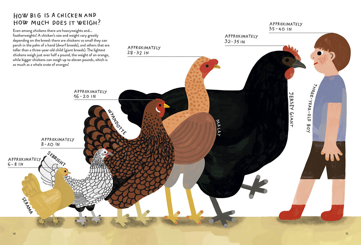
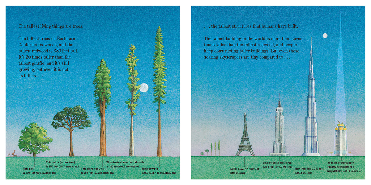
Concrete works: it is illustrative and informative. Concrete makes it possible for children to be the ones who grasp first.
But data, out of all things, is not concrete. Data is an abstract thing, and if we want to get closer to it, we need to learn the steps of that abstract dance. Visual comparison of concrete elements prepares the child to make comparisons with bars that stand for quantities of books even though looking nothing like a pile of books.
Data that can be found in nonfiction picture books is often on one specific theme: the climate crisis. I believe children are ready for it, moving from concrete towards abstract, if only the children’s book makers are. Children are skilled in reading pictures. They return to the same books in order to understand more. They don’t mind if they don’t catch all at once.
We’ve lived through 2020 and the pandemic. The visual world took a turn, and it was towards data and its qualities and particularities. And more has followed: we understand wars, conflicts, election results, weather phenomena and forest fires through maps; trends of inflation and consumer prices through increasing lines; amounts of species in danger of extinction through rising bars and the weight of health or defense costs of a state budget through pie charts. Professor Alberto Cairo remarks in his book How Charts Lie: Getting Smarter About Visual Information (2019) how
“many of us are cajoled by the mere presence of numbers and charts in the media we consume, no matter whether we can interpret them well”.
Charts and graphs are captivating pictorial creatures that catch our attention. They can be powerful tools to our thinking. That is – if we can read them, and if we feel welcome doing it.
Illustrator Molly Bang writes in her book Picture This: How Pictures Work (1991):
“…we often respond to confusion with anger: because we don’t understand the picture emotionally and think we ought to, we can feel stupid and rejected, pushed outside the image.”
I bet a lot of people have felt this way looking at a data visualization – I know I have. Bang shows in her book how to build a picture that affects our emotions, not through its narrative means but with structural elements: how we perceive shapes, colors and other compositional elements of a scene within the context of our own experience.
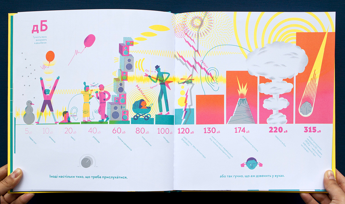
For example: horizontal shapes give us a sense of stability and calm. Round shapes imply security and even huggability. Pointed shapes make us feel more scared. The larger the object, the stronger it feels. Regularity and irregularity are powerful.
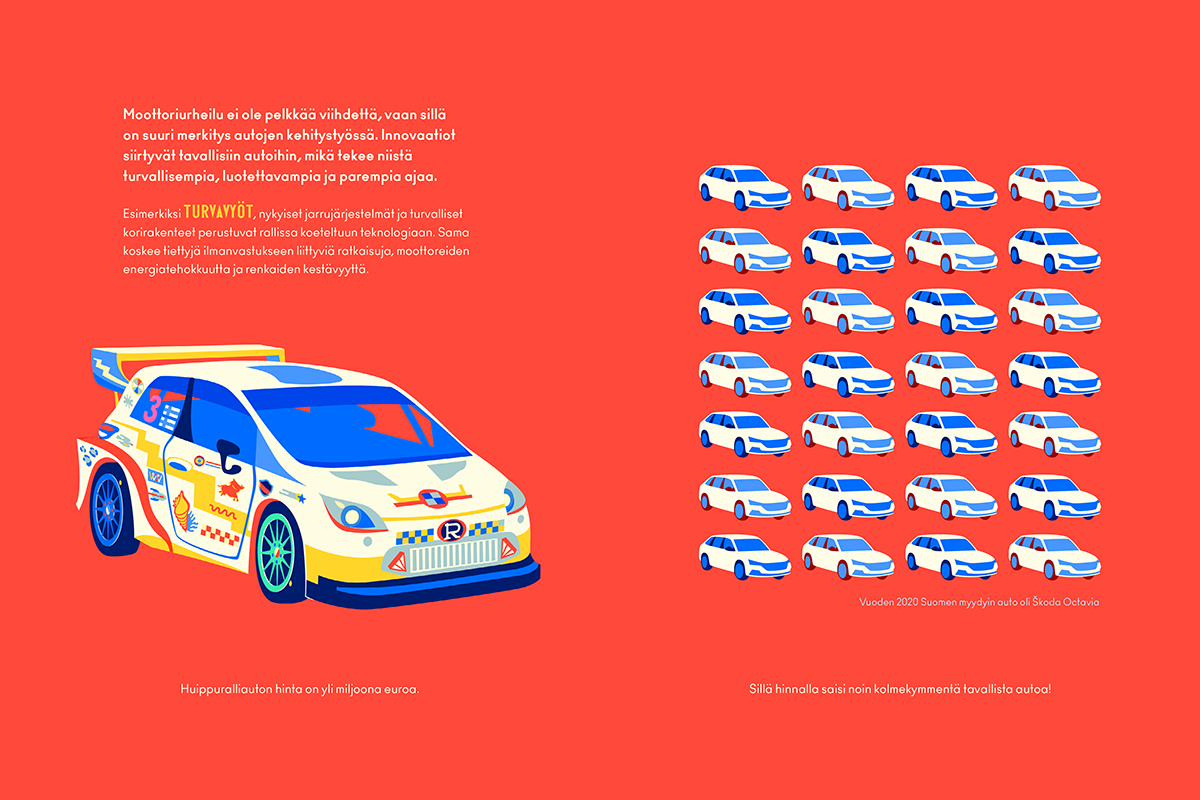
This spread of Rallitalli, a nonfiction picture book about rally car racing that I’ve illustrated, compares the price of one rally car to normal cars, but the main text talks about the significance of motor sports: how it’s not just entertainment but a testing ground for new innovations later moving forward to mass production, among them seat belts. The spread with this message is among the most important ones in the book, and that’s why it has a red background. And it has a repetitive, steady rhythm: the illustration is not leaning towards a specific direction.
I wanted beholders to stop and pay attention.
If you were to see me speak right now, I would pound my chest when saying this: Children behold pictures here. Children are sensitive to colors and hues, and to the emotional charge of a picture. They react to the scary bits, they recognise the sadness, they feel the joy. To get a message through, to welcome the beholder, you need to have the right emotional tone built in the picture – or data visualization.
We also need to know we can trust those pictures. With artificial intelligence in the picture, we need to be more vocal about where lies the fact and where the fiction in pictures of communication. (The place where to do this is back matter – which is obvious, if you are in the United States.)
All of this is true for adults, too, especially in one specific situation: we all need pictures in times of crisis.
Illustrating data is an approach on data and knowledge that takes into account concrete pictorial means and emotional clarity. We need them to get messages through in a way that everyone understands, no matter what their age or level of education is.

Illustration is concrete; illustration is accessible, and it has the potential to be emotionally very powerful. All these qualities make it possible for illustration to grow towards communicating more abstraction – i.e. data. We haven’t seen too many examples of that yet. For nonfiction illustrators it might mean learning new skills, but what is needed most of all, is curiosity towards new visual worlds.
This was my Manifesto’s third and final part. Interested in more articles on illustrating data? Subscribe to my newsletter!
Sources:
- Alberto Cairo: How Charts Lie – Getting Smarter about Visual Information (p. 16), W. W. Norton & Company (2019)
- Molly Bang: Picture This – How Pictures Work (Revised and Expanded 25th Anniversary Edition). Chronicle Books (1991, 2016)
- Jer Thorp: Living in Data – A Citizen’s Guide to a Better Information Future, MCD Picador / Farrar, Straus and Giroux (2021)
Jonathan Schwabish: Better Data Visualizations: A Guide for Scholars, Researchers, and Wonks, Columbia University Press (2021) - Martin Salisbury & Morag Styles: Children’s Picturebooks – The art of visual storytelling, Laurence King Publishing (2012)
- Kaisa Kaatra, Anne Ketola ja Maija Ylätupa: Kuvien käyttö selkoviestinnässä in Tutkimusretkellä selkokieleen, Gaudeamus (upcoming 2024)
- Franconeri, S. L., Padilla, L. M., Shah, P., Zacks, J. M., & Hullman, J.: The Science of Visual Data Communication: What Works (2021)
- Kivinen, K., Aslama Horowitz, M., Havula, P., Härkönen, T., Kiili, C., Kivinen, E., Pönkä, H., Pörsti, J., Salo, M., Vahti, J., & Vuorikari, R.: Digitaalinen informaatiolukutaito, Faktabaari (2022)
- Betsy Bird: 31 Days, 31 Lists: 2023 Math Books for Kids / A Fuse 8 Production – A School Library Journal Blog (9.12.2023)
- Pirita Tolvanen: Presentations of Data in Nonfiction Picture Books in the U.S. / Illustrating Data (2.8.2022)
- Pirita Tolvanen: Numerical Data / Illustrating Data (30.6.2022)
- Pirita Tolvanen: Visual Workflows of Nonfiction Picture Books / Illustrating Data (10.2.2023)
- Ben Schneiderman: Data Visualizations Breakthrough Moment in the Covid-19 Crisis / Nightingale (30.4.2020)

Leave a comment