Looking through nonfiction picture books in my research I started to notice timelines in which time was not visualized properly. Often, they were events in time placed side by side with or without a line. Like this:

It does look like a timeline. But time isn’t actually visualized: it’s numerical information, and if you want to get a sense of the scale, you need to start adding up yourself. The visualization doesn’t help you in that.
This is how the same numbers look visualized as a timeline:

You see the 123 year difference between the first two years, and how close to one another the last six years are. All in all, it is easier to understand. You don’t need to bother your brain as much as with the first one. As a designer you will have a harder time in placing them on the scale – yes, the designer needs to do the adding up, not the viewer.
Why does this matter?
Depending on the context and the content, the first timeline could be categorized as misinformation, visual lying. It leads towards the interpretation that the progress is steady; that the events are happening one after another step by step – when they are not.
In museums or, for example, on websites you often see lists such as this – sometimes with a ‘timeline’ in their title:
- 1820 Birth of Florence Nightingale
- 1845 Florence decides to become an nurse
- 1851 Rejected proposal of marriage and attended nursing school
- 1854 Volunteered for service in the Crimean War
- 1859 Received a government grant to open a school of nursing
- 1869 Opened the first Women’s Medical College
- 1910 Death of Florence Nightingale
It’s not a timeline, and even though the events are listed steadily one after another. I wouldn’t call it misinformation – by any means. It is a list of highlights. But more than a final outcome, I see it the start of something. It could be the beginning of a beautiful timeline!
Or it could be a start of a story.
Time in stories
Biographies have been a trend in children’s nonfiction in recent years, and very often they present the events of a person’s life in a chronological order. My debut nonfiction picture book Flying Finn – The Life of Jarno Saarinen (2018) did that, too. But it was still structured as a story, as are most of biographies. That’s different than what a timeline consists of, where the focus is instead on highlights; on the important bits and pieces.
A story has highlights, and it has a beginning, middle and an end. It has a narrative arc with rising tension, a climax and a resolution. A story usually is selected to elicit an emotional response.
The difference between a story and a timeline can be see in The Important Thing About Margaret Wise Brown (Mac Barnett, illustration by Sarah Jacoby; Balzer + Bray 2019), a picture book biography of Margaret Wise Brown. The book has 42 pages: one for each year Brown lived. It is the structural base of the book, and you could call it a timeline in the form of a book.
And it is very memorable. I don’t think it’s possible to read that book and not remember how old Brown was when she died.
Time in charts and graphs
In a lot of charts and graphs we find in nonfiction picture books or in our daily media consumption, the x-axis (the horizontal axis) represents the passage of time. The x-axis is often, basically, a timeline.
One brilliant example of data-intense visualization structured on a timeline is Nuclear Risk: An Expanding Concern by Giorgia Lupi. You see bars, stacked lines, different color coding and symbols for quantities; but the main structure is still a round timeline of 80 years, suggesting the approach of a full circle in the nuclear arms race.
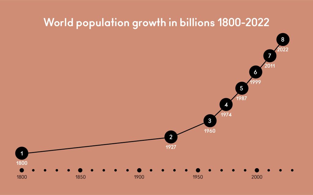
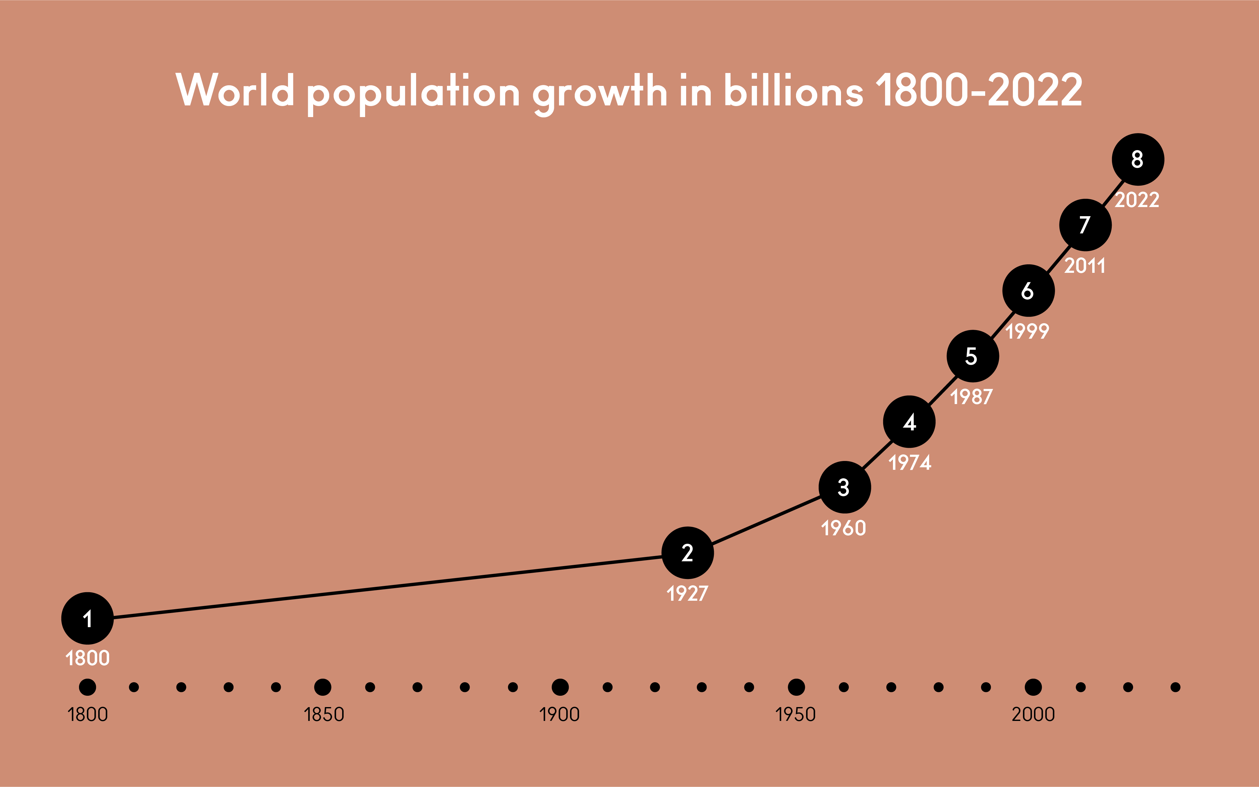
The timeline at the beginning of this article depicted world population growth in billions; each year represents one billion people, starting from the first estimated billion of people in 1800. Below you can see that information depicted as a graph, showing years 1800-2022.
Misinformation is false information that is disseminated, promoted or published, without intending to deceive or persuade. Disinformation is false information that is disseminated, promoted, or published, with the intent to deceive or persuade. With disinformation, the one who creates or distributes it is well aware of the false content. They know what they’re doing.
One very usual way to deceive with charts and graphs is to manipulate the x-axis to only show narrow piece of data, the so-called highlights, to support an agenda. One might think of it as cherry picking.
I sometimes think it was Facebook and their 2011 introduction of the timeline that contributed the most to confusion around timelines. I don’t think I’m wrong when I say Facebook’s timelines aren’t to be trusted if you want to have an accurate depiction of the passage of time (or reality). They are not designed for that purpose. They emphasize highlights. Timelines in Facebook’s (or even wider in the social media’s realm) are better described as presenting a story.
Sources:
World Population Growth: United Nations Population Division
Heritage-History: Florence Nightingale
Nightingale: Florence Nightingale is a Design Hero

Leave a comment