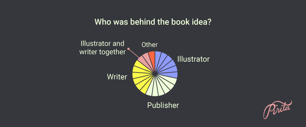
I conducted a survey for the illustrators, graphic designers and editors of the 23 nonfiction picture books published in Finland in 2021. I wanted to know how the books were made. What was the visual workflow, what were the responsibilities of each professional involved, and maybe as the main question: who’s vision was the book’s visual look based on?
The survey was linked to a review of the 23 books, which you can find here in Finnish. I received responses from 19 illustrators; among them were two illustrators that had illustrated two books, ie. the part of illustrators covered 21 books. Furthermore I received responses from three graphic designers and five editors. Looking at responses from all roles, the survey covered eight books.

Altogether there were 1222 children’s and young adults’ books published in Finland in 2021, and 139 nonfiction titles. My definition of a picture book defined the take: I wanted there to be a viable, balanced visual/verbal narrative. Books in which text led the way were excluded.
Finnish nonfiction picture books often have quite a lot of extent. It’s not unusual to find picture books of 56 pages. The books of the review were mostly aimed at an audience of 5 to 10-year-olds – only a couple were aimed at toddlers.
Illustrators have a strong role
Let’s start from the very beginning. Who was behind the book idea?

The illustrator; the writer; the publisher; each get credit for six books. Two books were a shared idea of the illustrator and the writer. One book was born out of an idea from an outside organization.

In 43% of the books the illustrator did the graphic design, too.

The book’s visual look was based on the illustrator’s vision in more than half (57%) of the books (3/4 of these illustrators were in charge of the graphic design also). There was collaboration, of course, but it was the illustrator’s vision that led the way, and the decisions made by the graphic designer and editor followed along and respected this. In roughly a quarter the book’s visual look was clearly a shared vision of the illustrator and the graphic designer (and they were two different persons).
The third scenario was a team where the illustrator had a clearly defined role. Based on the responses it was unclear who had the main vision of the book’s visual look in this scenario, but I’m assuming it’s the art director of the publisher.

Illustrators were involved in the process ever since the beginning in most cases.
Sometimes during my Fulbright scholarship in the United States I really had to choose my arguments on why I focus on illustrators when I talk about data visualization; wouldn’t art directors or graphic designers be a more suitable audience? They already know what data visualization is, after all. They have the skills and tools to do it. Illustrators don’t necessarily even know what it is. Many illustrators don’t know graphic design or have never included text to their illustrations.

I know this. But there are also illustrators who see the graphic side of things as an essential part of their illustration: me, for example, and I’m not the only one, shows the data above. Almost a half of the respondents see data visualization or information design a part of their work as an illustrator, at least to some extent. These illustrators are usually great visual communicators and very comfortable in communicating through text and image. Their vision of a book isn’t limited only to illustration but reaches to typography used, design of end sheets and title page etc., even though there would be an art director or a graphic designer to work with.
It is noteworthy, too, that illustrators often spend the most time working on the book. It took illustrators an average of 4,3 months to illustrate the book, when estimated in 40-hour work weeks.

Data visualization for an unaccustomed audience relies more heavily on pictures. Accessible data visualization considers the emotional tone and structure of pictures. More weight on visual clarity is needed. If it is a new kind of visualization for the beholder, they need to be guided in the right direction, towards the visually important bits. It needs to be done verbally, too, but primarily it needs to be done visually. That way the visualization won’t exclude the beholder, but welcome.

More than half of the respondents had control over how much text appeared on a spread. Not everyone responded: those who had written the book they illustrated.
This is a small but important question and tells about collaboration vs. hierarchy. I would like to think that when collaborating everyone gets to share their views on all matters, but not everyone gets to see their ideas actualized. But they will be heard. I only focused here on the amount of text and not the content. The amount of text affects the illustrator’s work in a very practical way: how much space is left for the visual part.
Excerpts from Ole Munk
Why am I interested in these matters? What difference does it make when an illustrator starts working? Picture books are the most visual form of literature. To start creating a picture book with mere text has always sounded a bit irrational for me: the other literature forms are for that!
With data visualization it is the same thing: the text-based process needs to be reverted, if we’re really serious about this. If we really want the pictures to have their say, to communicate, to visualize information or data; not just decorate.
Ole Munk writes in his report Reporter or Artist …the two would be nice about the workflows of information graphics and illustration at 21 newspapers in Europe and the USA. Made already in 1992, it was still used as a central source for the chapter on workflows in the Data Visualization Handbook (Juuso Koponen, Jonatan Hildén and Tapio Vapaasalo, 2016). In their book Koponen, Hildén and Vapaasalo discuss how workflows haven’t dramatically developed towards better – at least not everywhere.
Munk writes:
“Traditionally, newspapers have been produced by “word people”, accomplished at using the left part of their brains, the center for analysis, logic, division and language.”
And continues about the traditional set-up for visual content:
“At many newspapers, the cartoonist is known for his droll ways and funny approaches. He is the “newsroom court jester”. But informational graphics is not just a question of funny approaches and imaginative drawings. If this form of communication is to be journalistically justifiable, it must be at least as comprehensible and reliable a purveyor of information as written text.”
Munk notes how “word people” appear to have substantial influence on what is being visualized—and how. He quotes a news editor on their approach to visual ideas:
“…we try to create unnecessary graphics. Then the content gets so thin, that it could easily have been put into the article. Or we try to create graphics which are so complicated, that they become too full of text—and too difficult to read.”
This matches my experience. The visual ideas of writers or copywriters or other “word people” are not bad, and they are necessary in the process. But they are not the visual ideas of visual people, and therefore shouldn’t be dominant. Everyone’s ideas should be heard.
I know I focus on illustrators maybe even a bit too much. I don’t mean it at the expense of information/graphic designers, writers or others in the process. I’m doing it because illustrators themselves don’t always see how much of a difference it makes that they really are there from the beginning; that they focus on the communication as much as the writer does, as much as everyone else in the process does. They need to perform high artistically, yes, but in nonfiction they need to perform communicatively higher.
“If the artist doesn’t fully comprehend the information to be presented, it’s a good bet most readers won’t either”.
Nigel Holmes, graphics director, TIME Magazine (The Poynter Report, Summer 1991)
Collaboration with Curiosity
I know data visualization or information design seem distant for many illustrators. I believe in collaboration; I really do. But a process where serious analysis and logic happen first and only after that – towards the end – illustrators have a clearly defined role with no control over the amount of text on a spread, is something other than collaboration. It’s a hierarchy where illustrators place low.
I’m writing this even though the survey showed how Finnish nonfiction picture books are following workflows that look good for data visualization. I’ve worked as an illustrator for more than 10 years and illustrated a lot of text-based ideas. Every now and then I’ve gotten to change the flow of the process and even revert it momentarily; and sometimes it’s all you need. But an even better scenario is to include the illustrator to the process from the beginning.
I would love nonfiction illustrators to be curious about data visualization. Curiosity is a perfect starting point for collaboration. Curious collaborators come willingly to the meeting where the process gets started, and they feel included and secure in sharing their views and listening to others. Curious collaborators understand what is being communicated through the mutual process, and why.
Curiosity moves us. Curious illustrators are more likely to start implementing data visualization or its elements to the books they are illustrating. Something good might come from that. And not just good: something logical and serious, too.
PS. I have written about workflows before: 
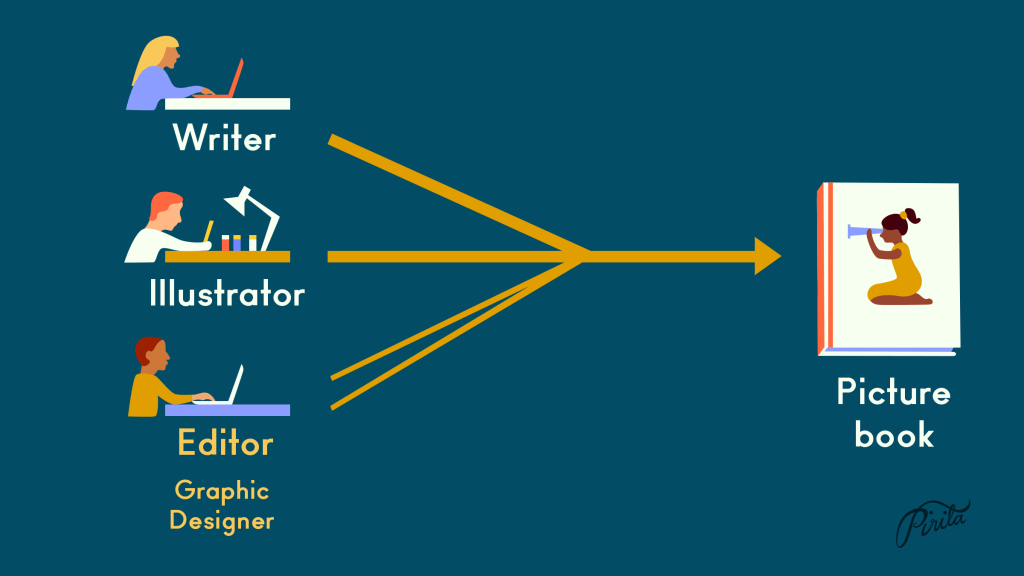
What’s so special about picture books? (20.12.2021)